Project Overview
Saar Studio approached with a clear vision of creating a brand identity that resonates with the innocence and delicate nature of newborns. The goal was to craft a visual experience that reflected not only the purity of childhood but also the studio’s commitment to capturing life’s tender moments with elegance and care.
Project Scope
- Logo Design
- Complete Visual Identity System
- Printables & Packaging Design
Whimsical Identity & Visual Language
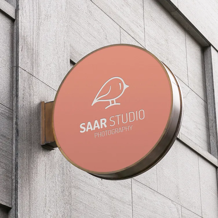
The logo design for Saar Studio drew inspiration from its name, which translates to “little bird.” A minimalistic yet endearing bird illustration became the focal point, symbolizing new beginnings and gentle care—core elements of newborn photography.
The chosen typeface, “Bonyad-e Koudak,” designed by Reza Bakhtiari Fard and Reza Ershadi, was selected for its playful yet sophisticated design. Its gentle curves and readability made it ideal for both print and digital use, enhancing brand consistency.
Soft & Playful Color Palette
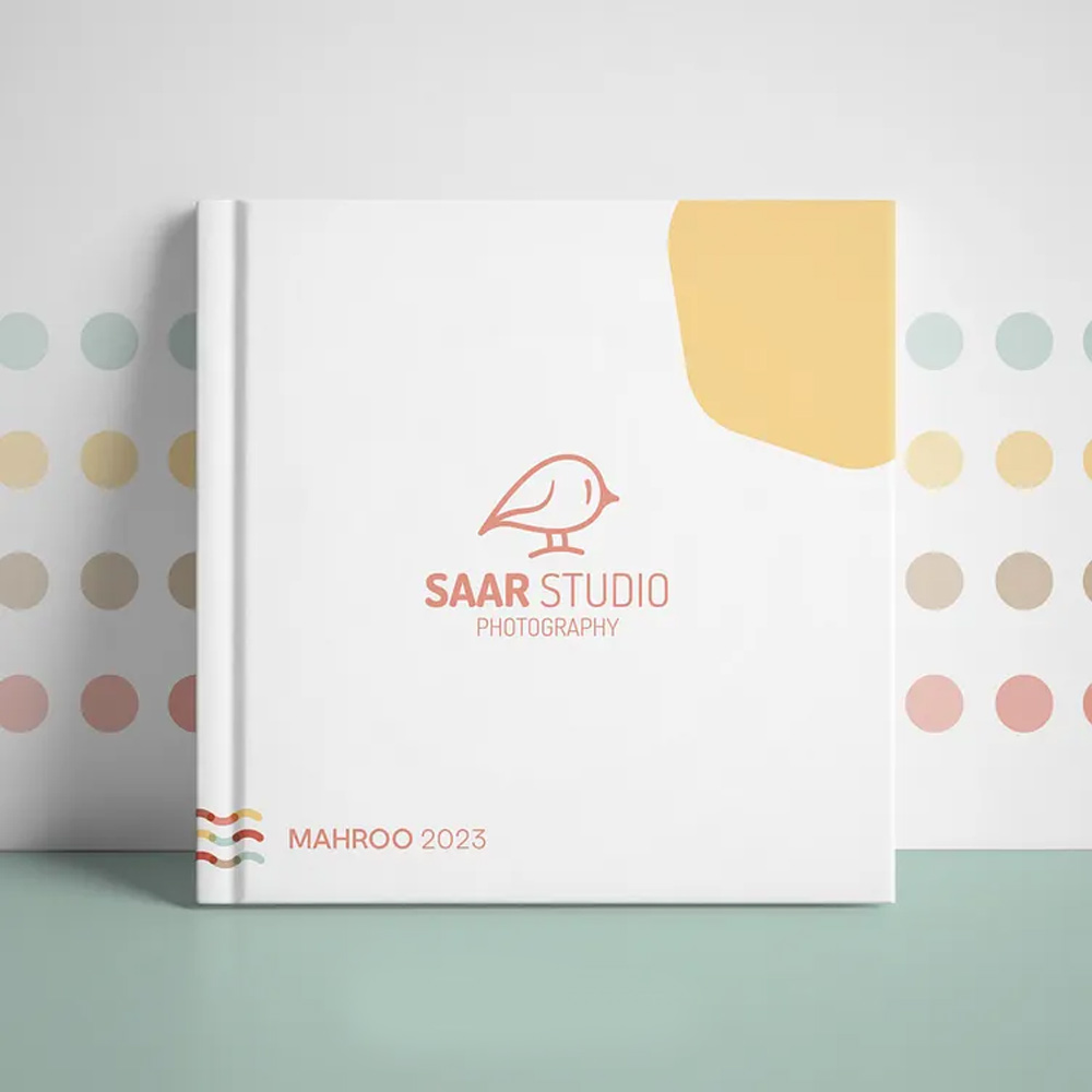
A vibrant yet soothing color palette was curated, blending soft pastels with bright accents. These colors were applied across all brand elements to maintain visual harmony and appeal to both children and parents. The clean white backgrounds added to the sense of purity and spaciousness, essential for a child-focused brand.
Patterns & Printables: Bringing Brand to Life
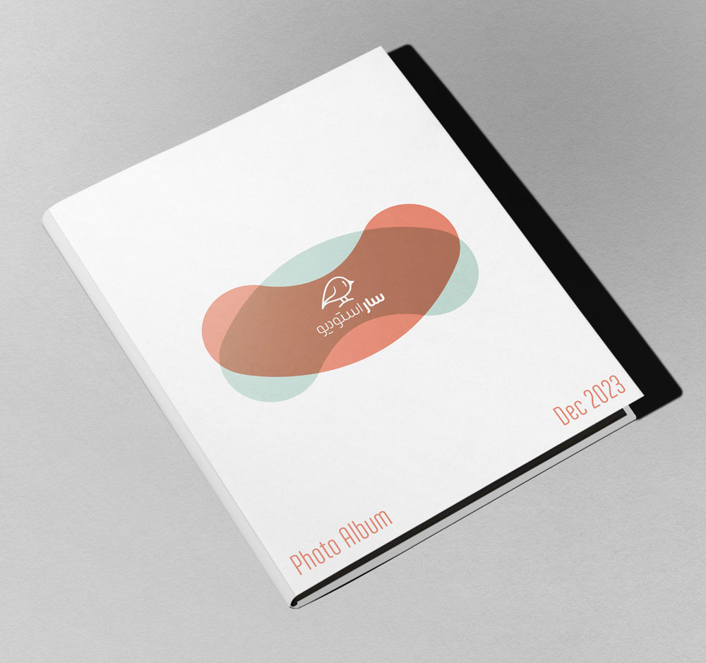
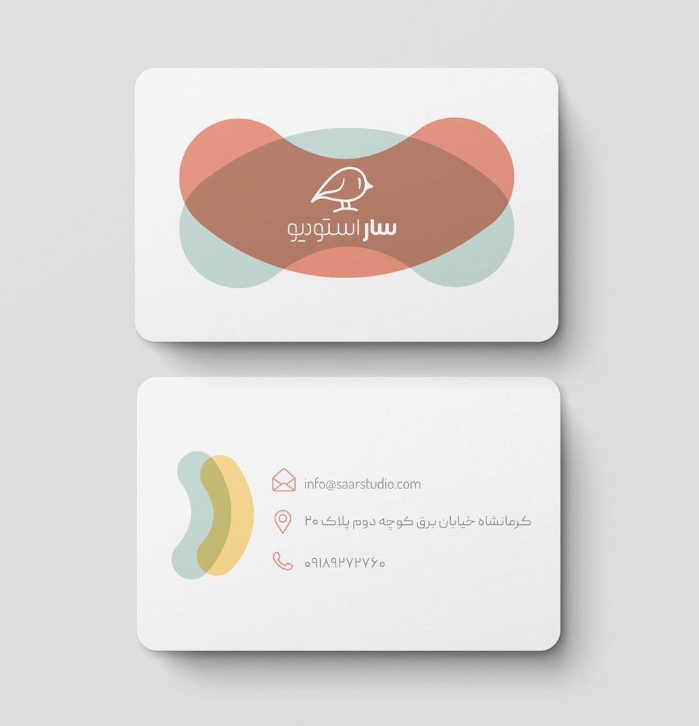
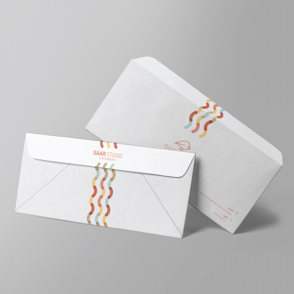
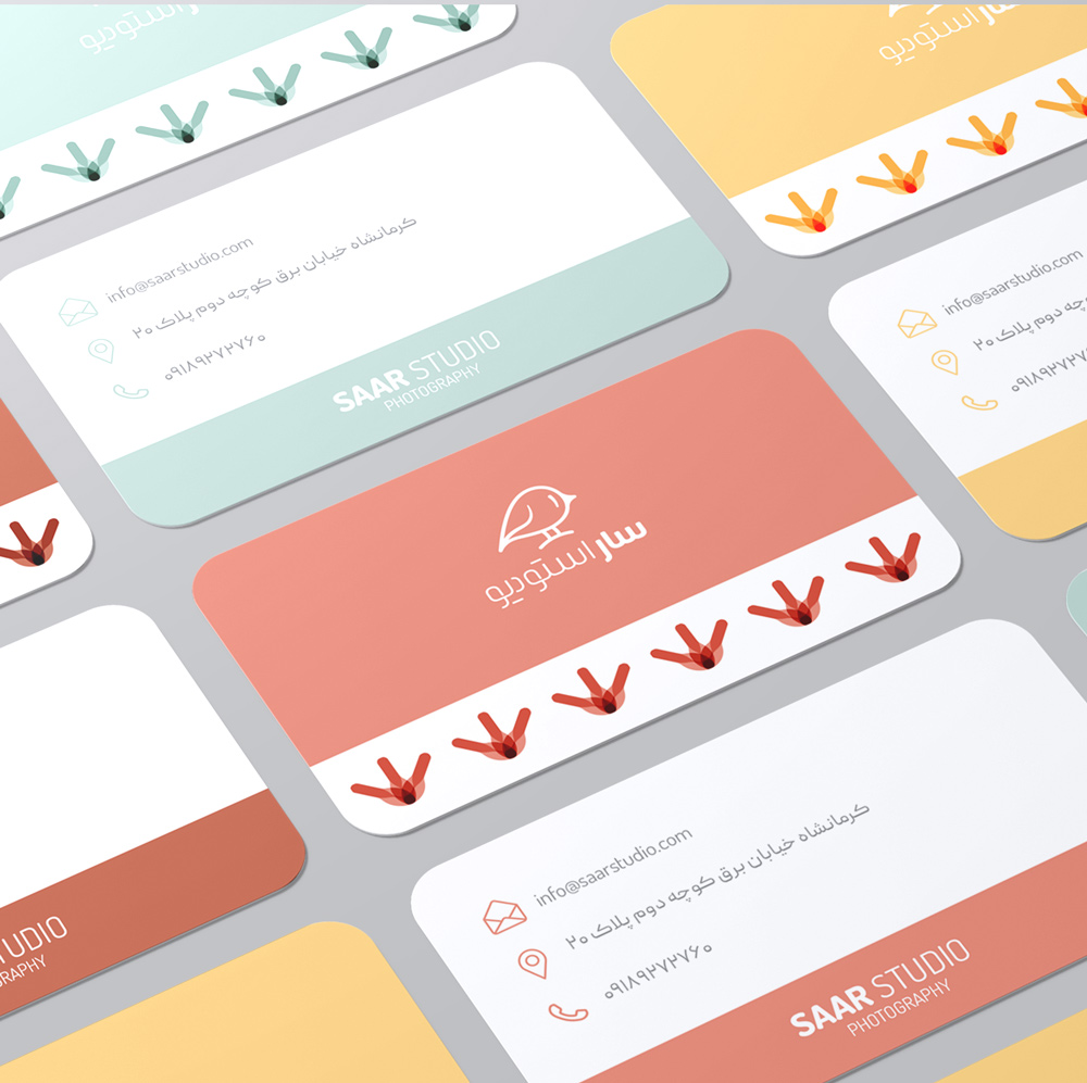
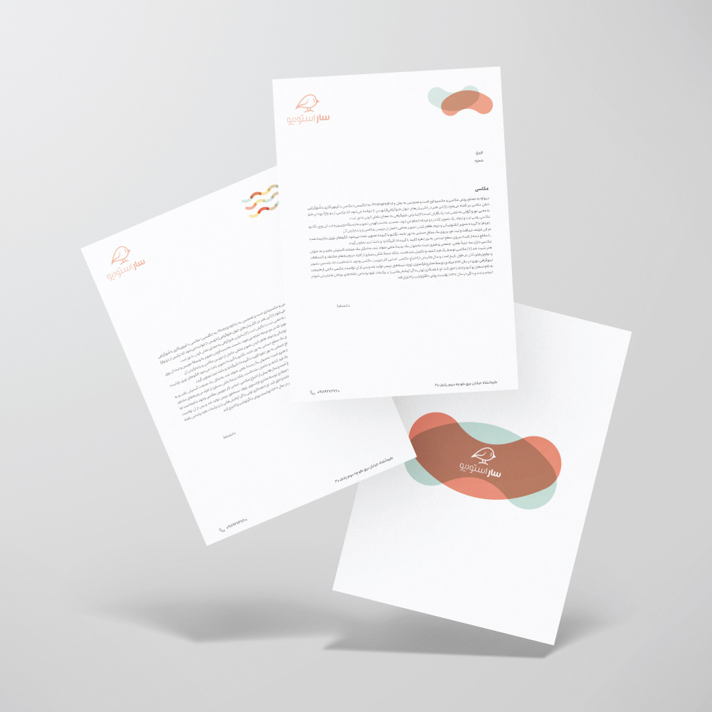
To further enrich the brand’s visual presence, a series of playful patterns inspired by the logo and color palette were created. These designs were applied to various print materials, including business cards, letterheads, and packaging. The patterns added a whimsical touch while maintaining brand cohesion across all printed elements.
Purposeful Packaging Design
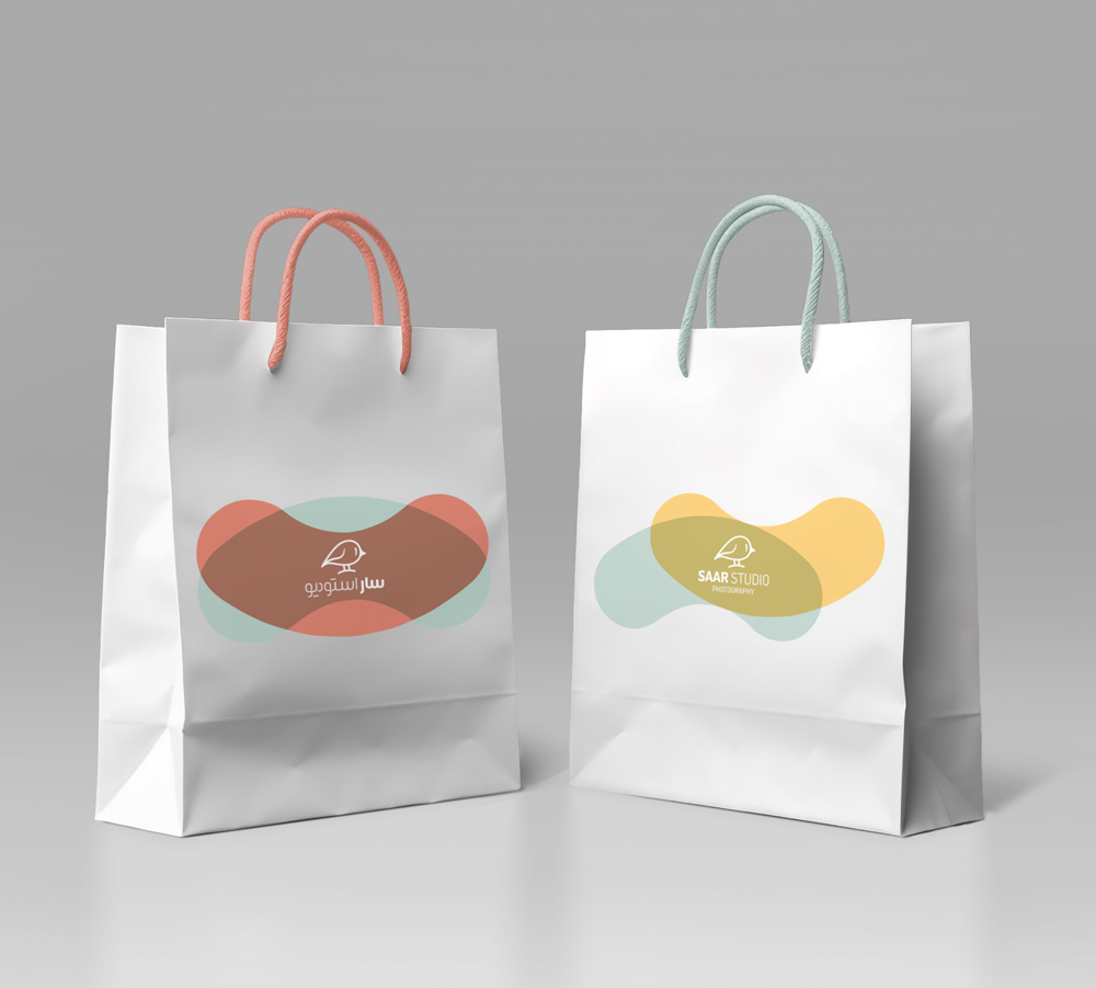
Packaging elements, including custom printables, were designed to extend Saar Studio’s brand identity. The minimalist bird motif and soft color palette were consistently applied, ensuring a seamless and delightful unboxing experience for clients. Each detail was thoughtfully crafted to reflect the studio’s gentle and caring nature.
Outcome
Saar Studio now boasts a visual identity that mirrors the innocence and tenderness of its photography. The cohesive design system effectively captures the essence of childhood, providing a memorable experience for clients and setting the stage for lasting memories.


