Renzo Café
A locally renowned coffee destination known for its exceptional beverage craftsmanship and cake selection, located in Kermanshah, Iran.
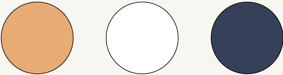
Color Pallete
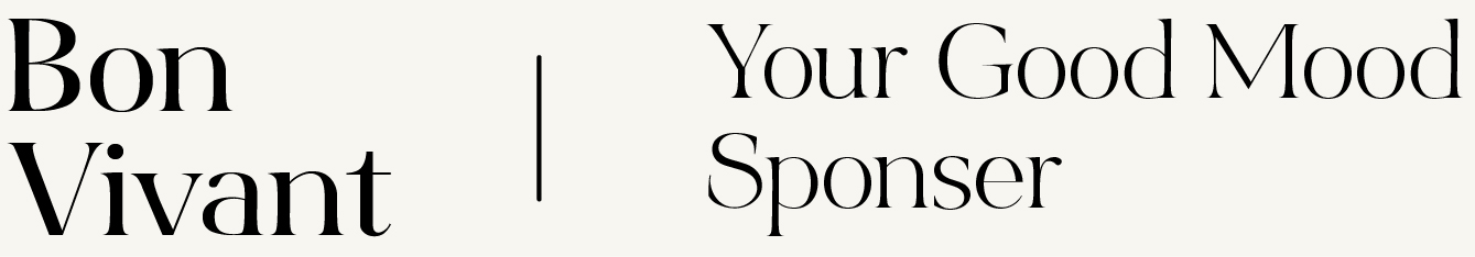
Typeface
Project Overview
When Renzo Café approached us, they had already laid a solid foundation: a well-designed interior, a loyal starting customer base, and a reputation for premium quality coffee and desserts. What they needed was a brand image that lived up to their excellence — one that not only matched the sensory richness of their café but also carried a sense of trust, legacy, and city-wide reach.
The core design brief was simple yet demanding: create a luxurious, timeless brand that communicates quality, nostalgia, and trust — all without losing the charm of a café that feels personal and welcoming.
Project Scope
- Logo Design
- Complete Visual Identity System
- Printables & Packaging Design
- Website Design
- Café Menu Design
Creative Approach & Design Language
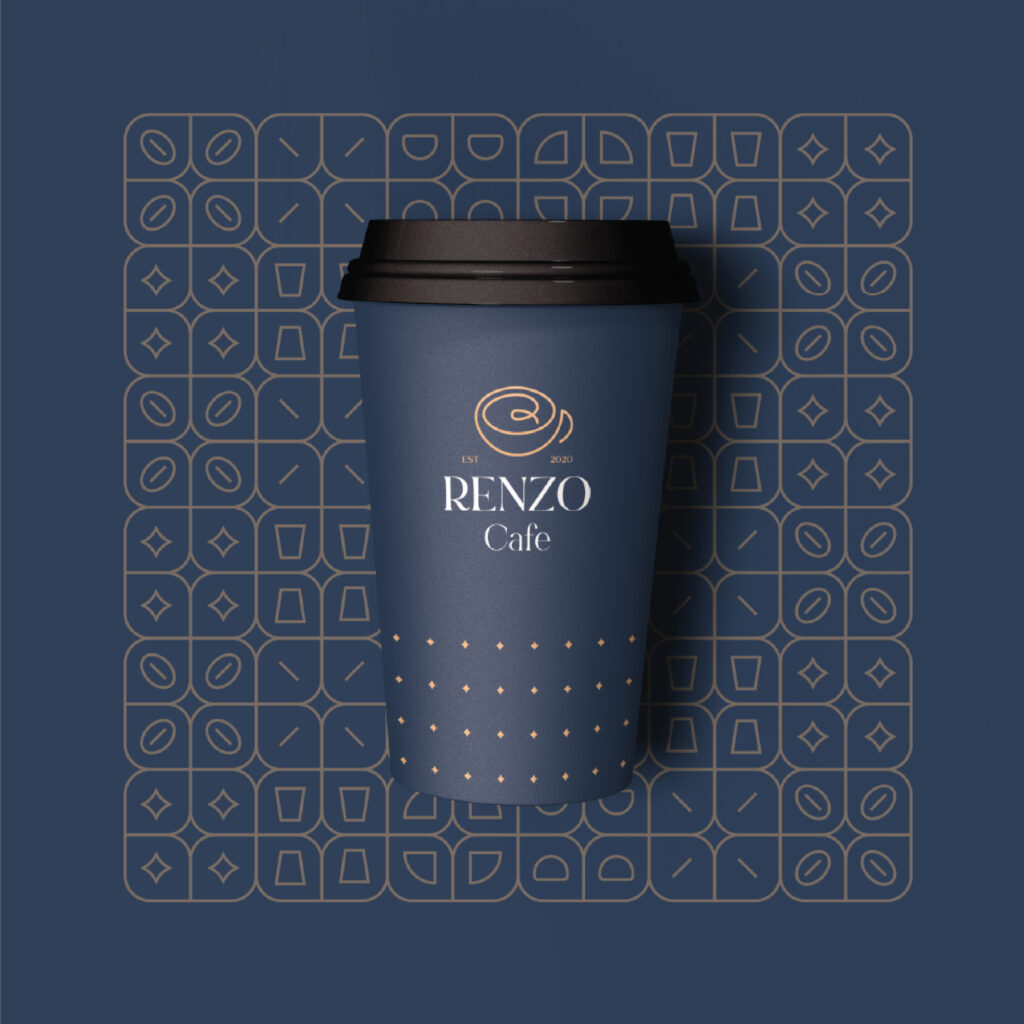
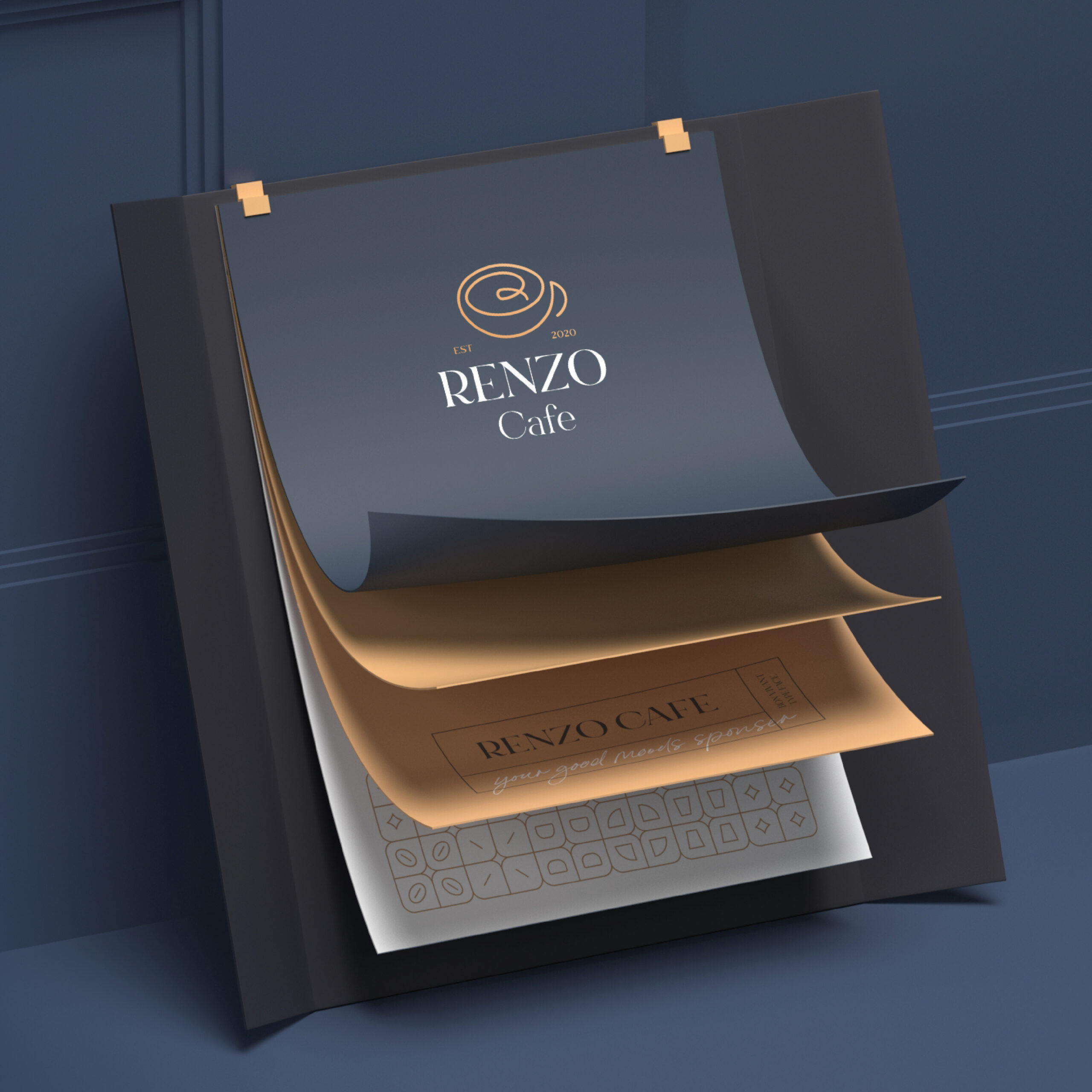
We began with the logo — the cornerstone of the Renzo identity. The icon emerged from the very essence of coffee: a refined “R” subtly formed in the swirls of a latte art, cradled inside a single-line coffee cup illustration. The elegance of this minimal line work echoed the timeless feel of a signature, suggesting not just a logo, but a mark of heritage.
For the logo type, we chose Bont Vivant, a serif font that balances high-end elegance with nostalgic warmth. To complement this, we paired it with a classic handwritten script, infusing the brand with both character and sophistication. This typographic interplay allowed us to communicate prestige and trust, while still grounding the brand in emotional accessibility.
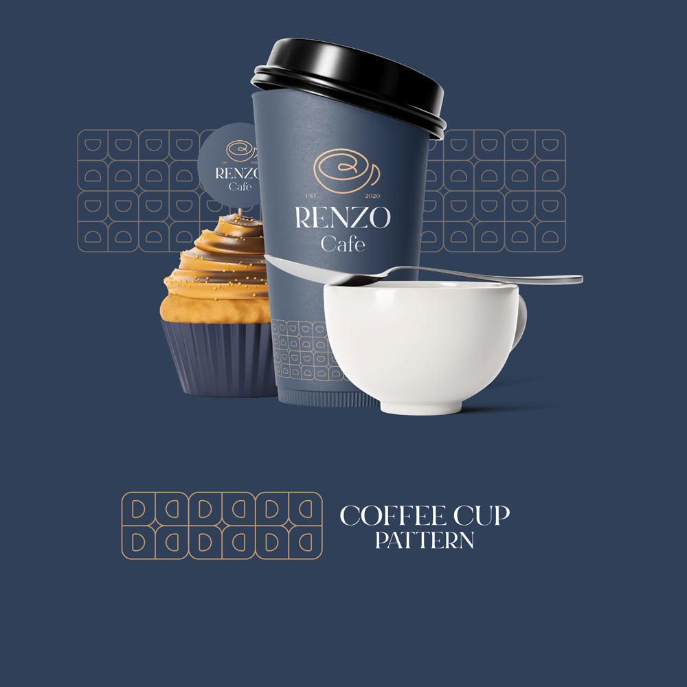
Our chosen color palette — a deep navy blue paired with golden-yellow accents and clean white text — elevated the identity further. It gave the visual system a grounded richness, where every detail felt curated and intentional.
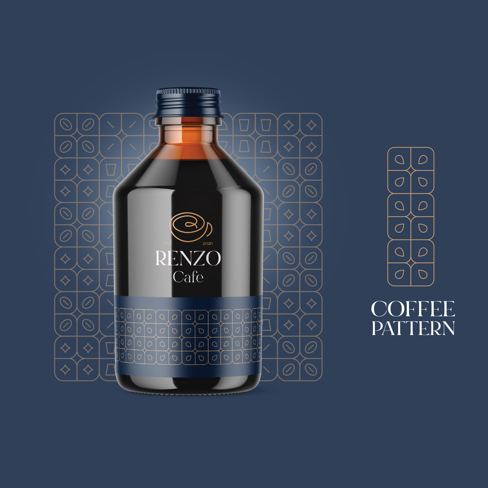
Patterns with Personality
In crafting the brand’s visual language, we developed a flexible pattern system that could adapt across different touchpoints. From day-to-night shifts to event-based packaging, the pattern could evolve. We incorporated minimalist icons: coffee cups, beans, cake slices, takeaway elements, and even ambient motifs like night stars or daylight rays — a symbolic nod to Renzo’s all-day presence in its customers’ lives.
This smart modularity allowed the brand to stay fresh and engaging without losing consistency.
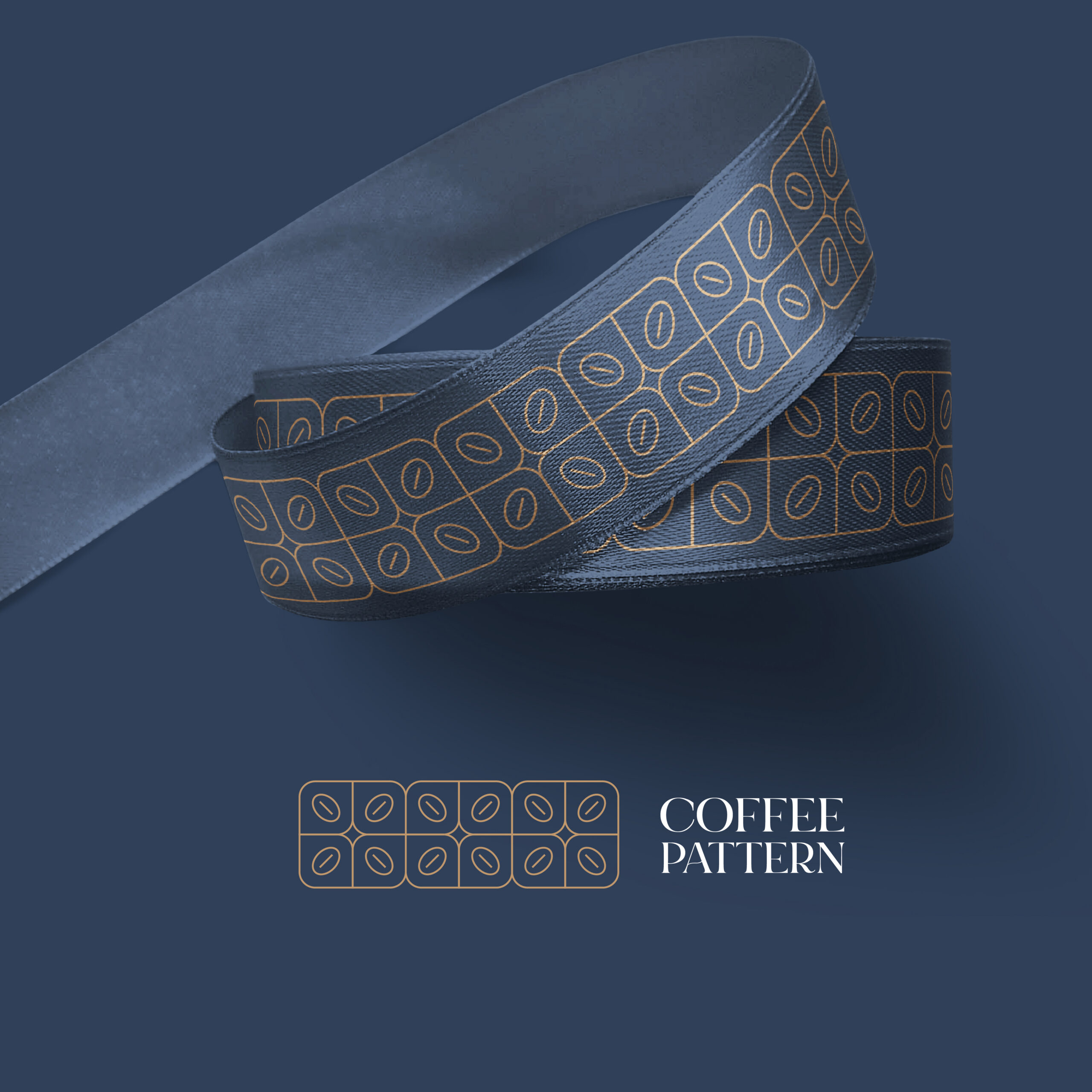
Packaging Design & Material Integration
Our next challenge was to bring the brand alive through its physical materials. With a rich brand system in place, we set out to design a range of packaging elements that reinforced the brand’s identity across touchpoints. This included:
- Paper cups
- Cake boxes
- Cold brew bottles
- Cupcake holders
- Branded ribbons
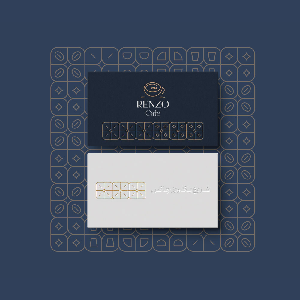
Each piece was carefully developed using the existing color palette, iconography, and typography to ensure seamless integration. The packaging wasn’t just functional — it became an extension of the Renzo experience.
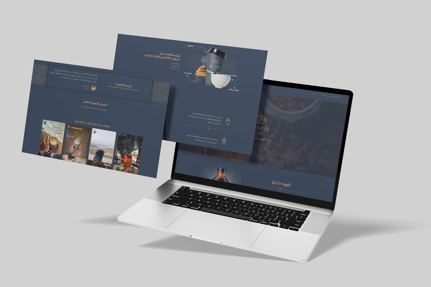
Website Development & Technical Management
To ensure Renzo Café’s identity translated online, we designed a fully responsive, editable website that hosts their menu, contact, and service updates. The site reflects the same visual identity and has been technically optimized for smooth performance across devices. We continue to provide technical support and management, ensuring the site evolves alongside the brand.
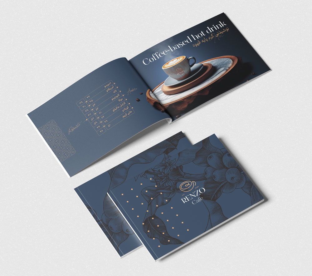
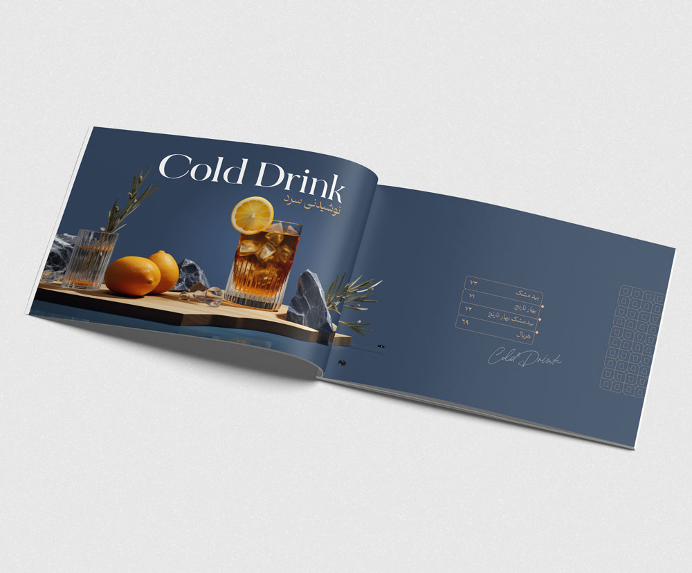
Menu Design in 3D Reality
To match the café’s premium aura, we envisioned a menu that felt as rich as the experience itself. Instead of traditional photography, we opted for a hybrid: we captured real product images, then rendered them into carefully staged 3D environments, featuring curated textures and ambient settings. This approach not only presented each item with visual luxury, but also added a sense of occasion to every drink and dessert.