OKO Team
OKO Team, a full-service creative agency based in Iran, delivering high-end 2D/3D animation, campaign strategy, photography, and videography.
Color Pallete
Typeface

Project Overview
Project Scope
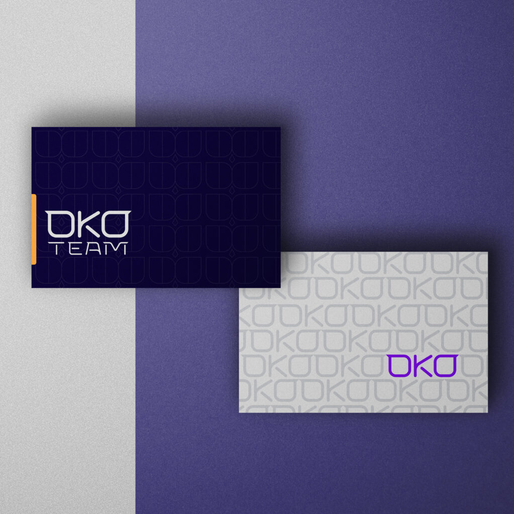
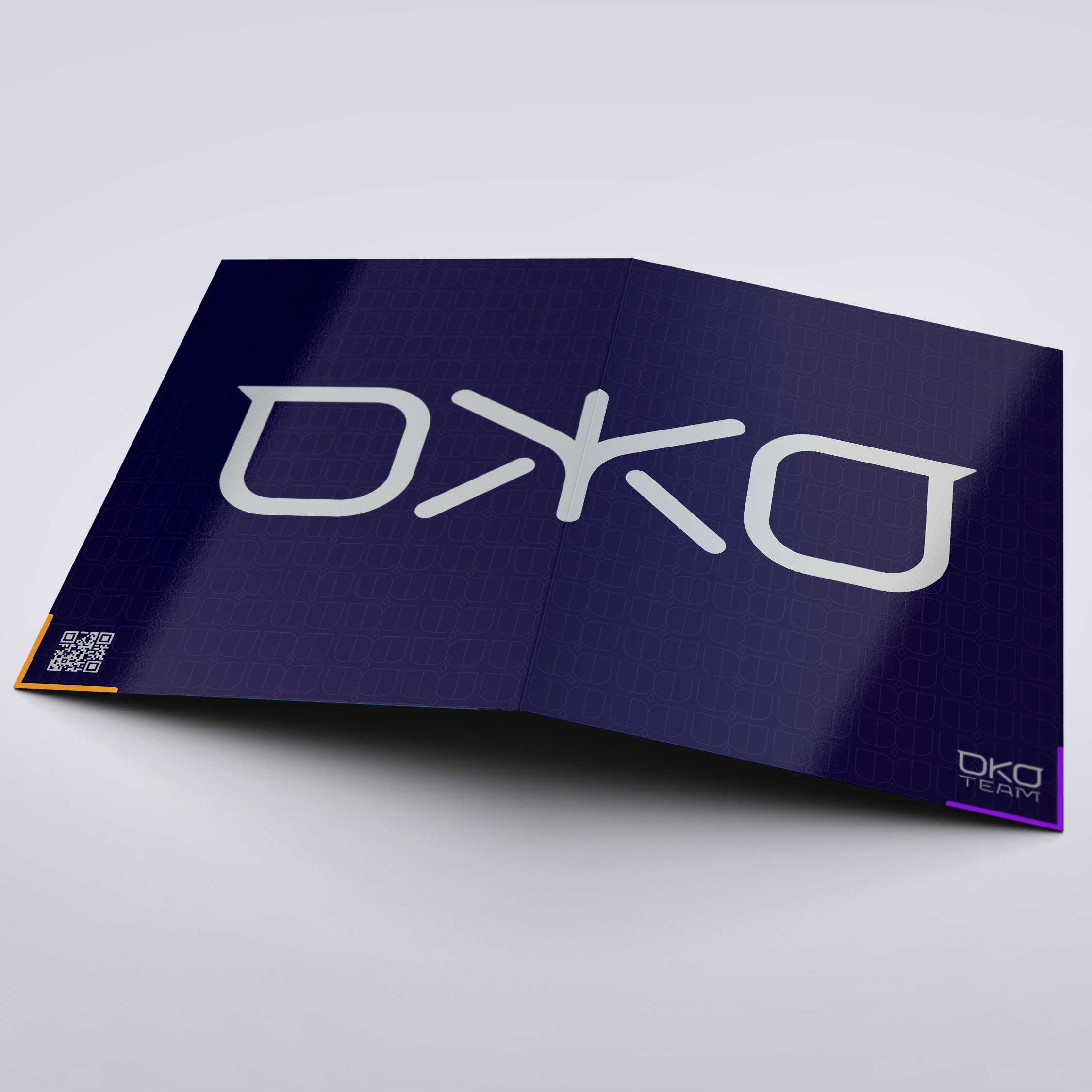
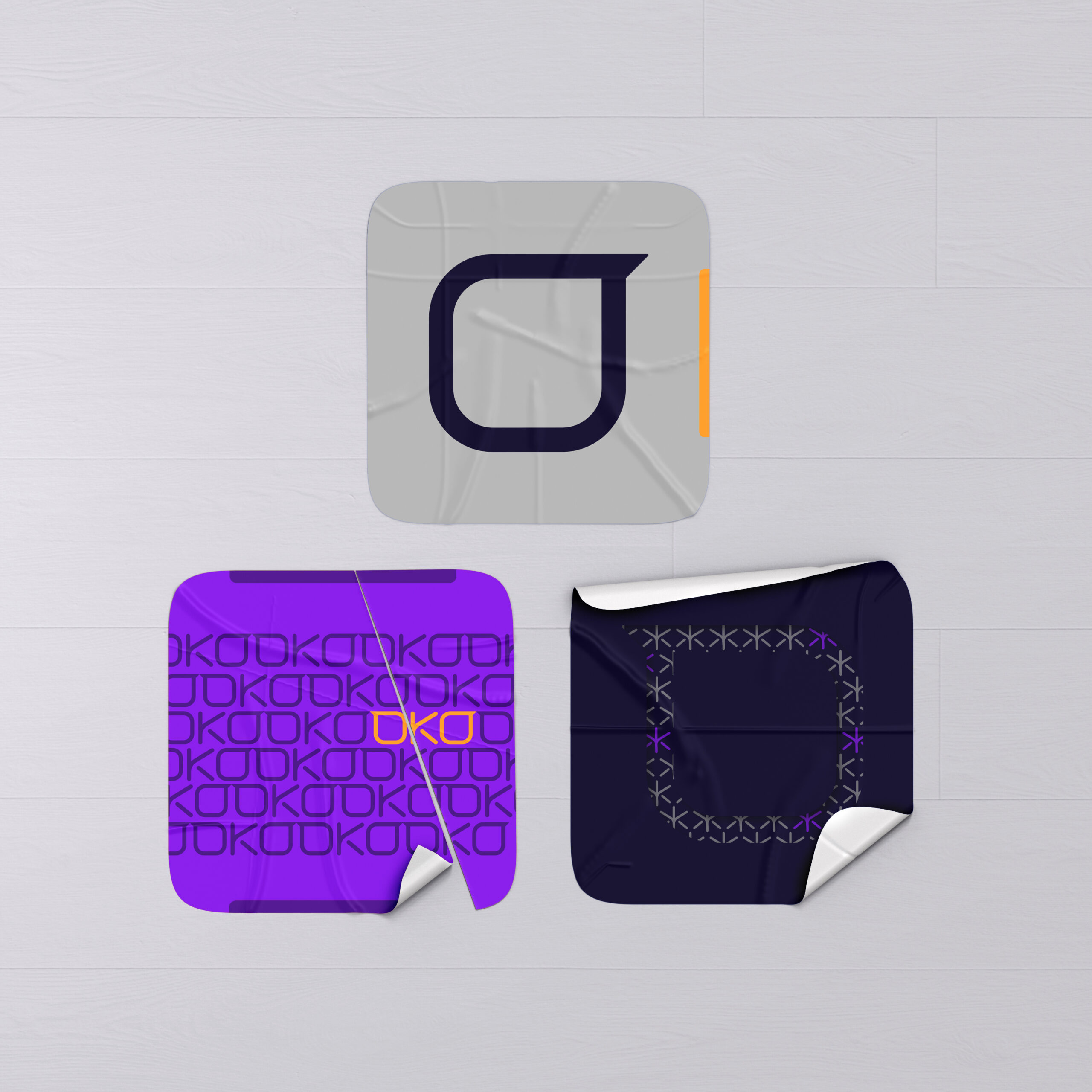
- Logo Design
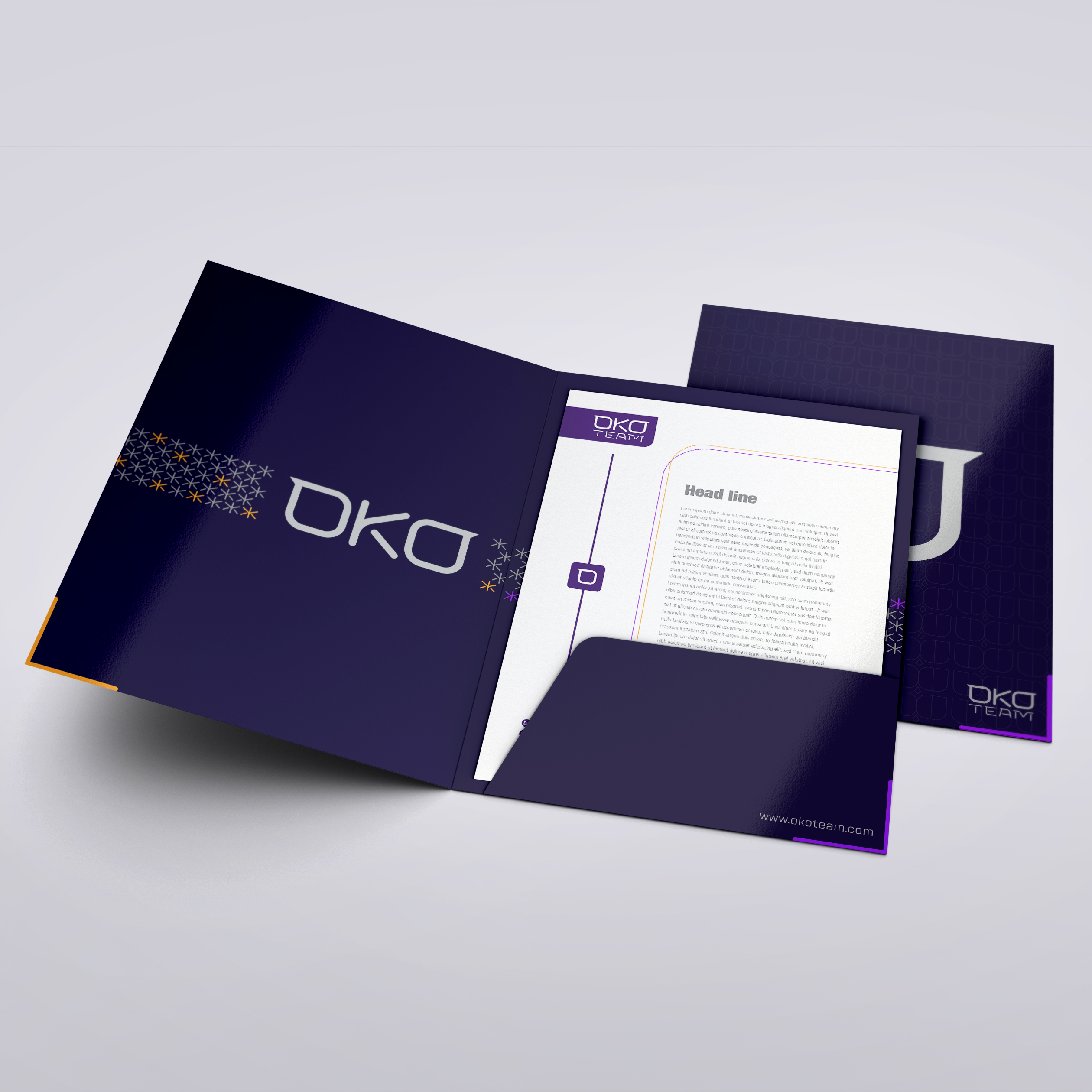
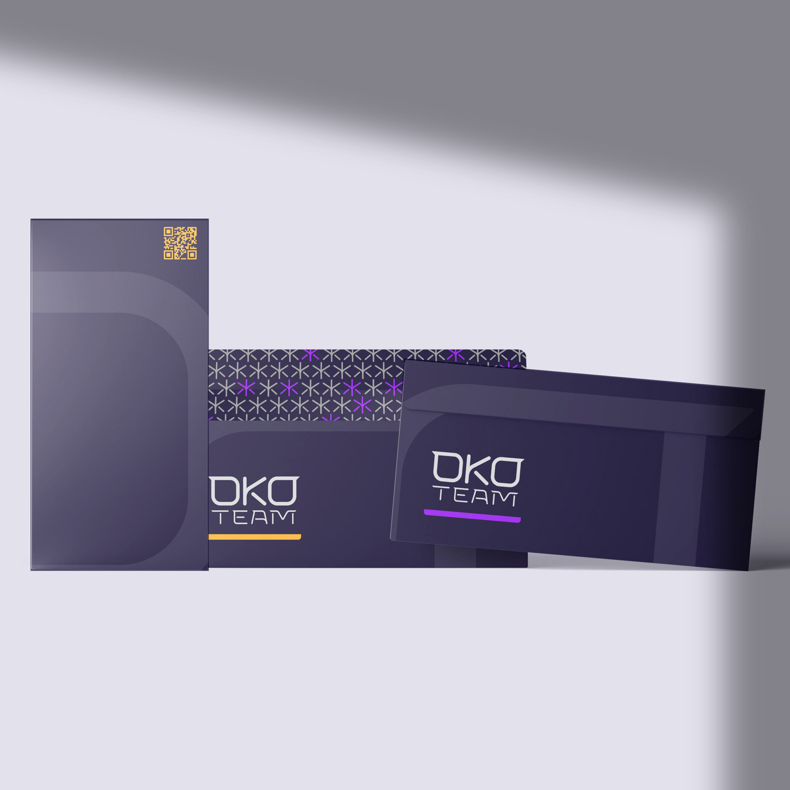
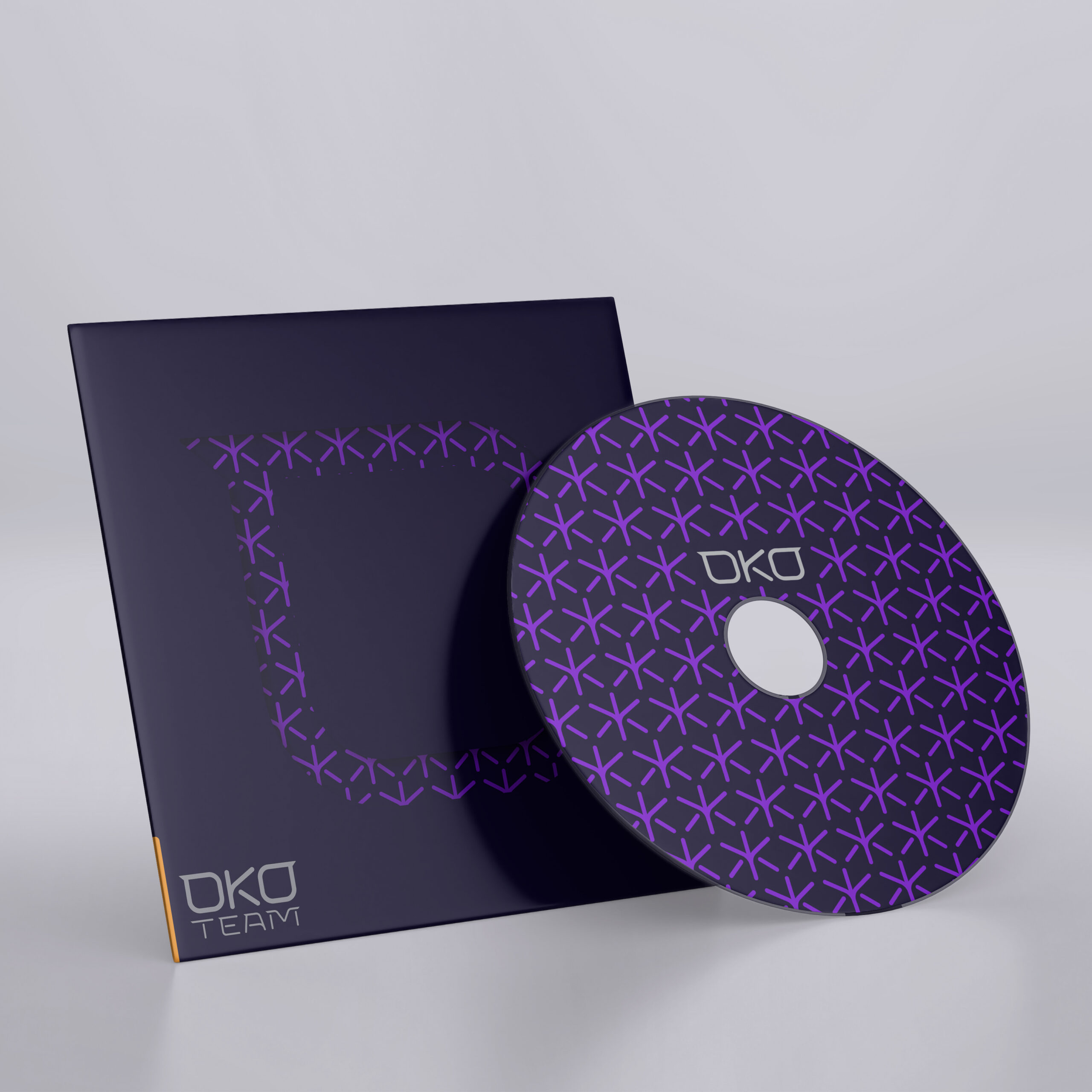
- Complete Visual Identity System
- Printables & Packaging Design
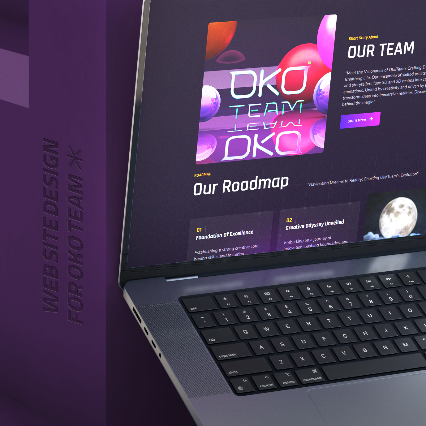
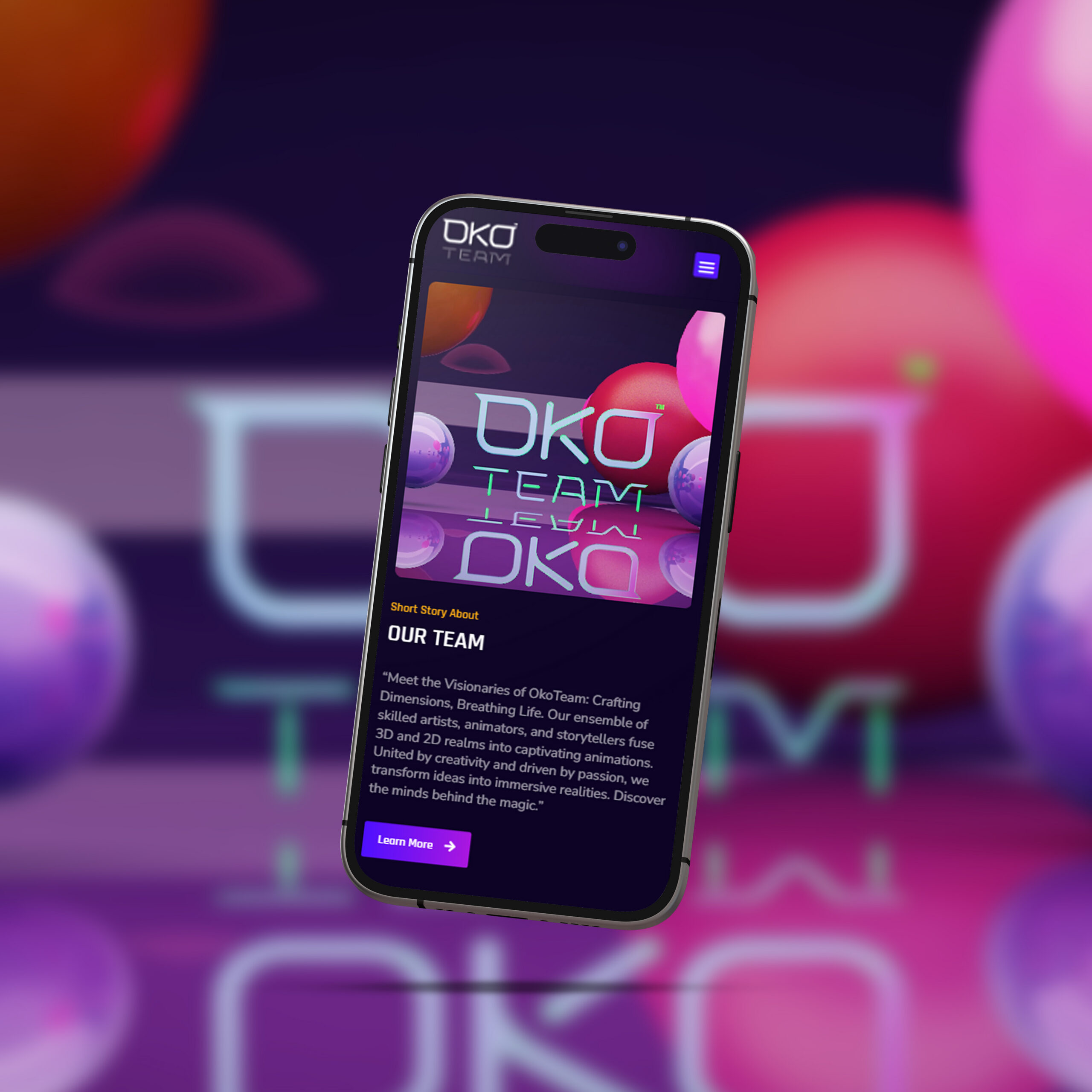
- Multilingual Website Design & Development (English + Persian)
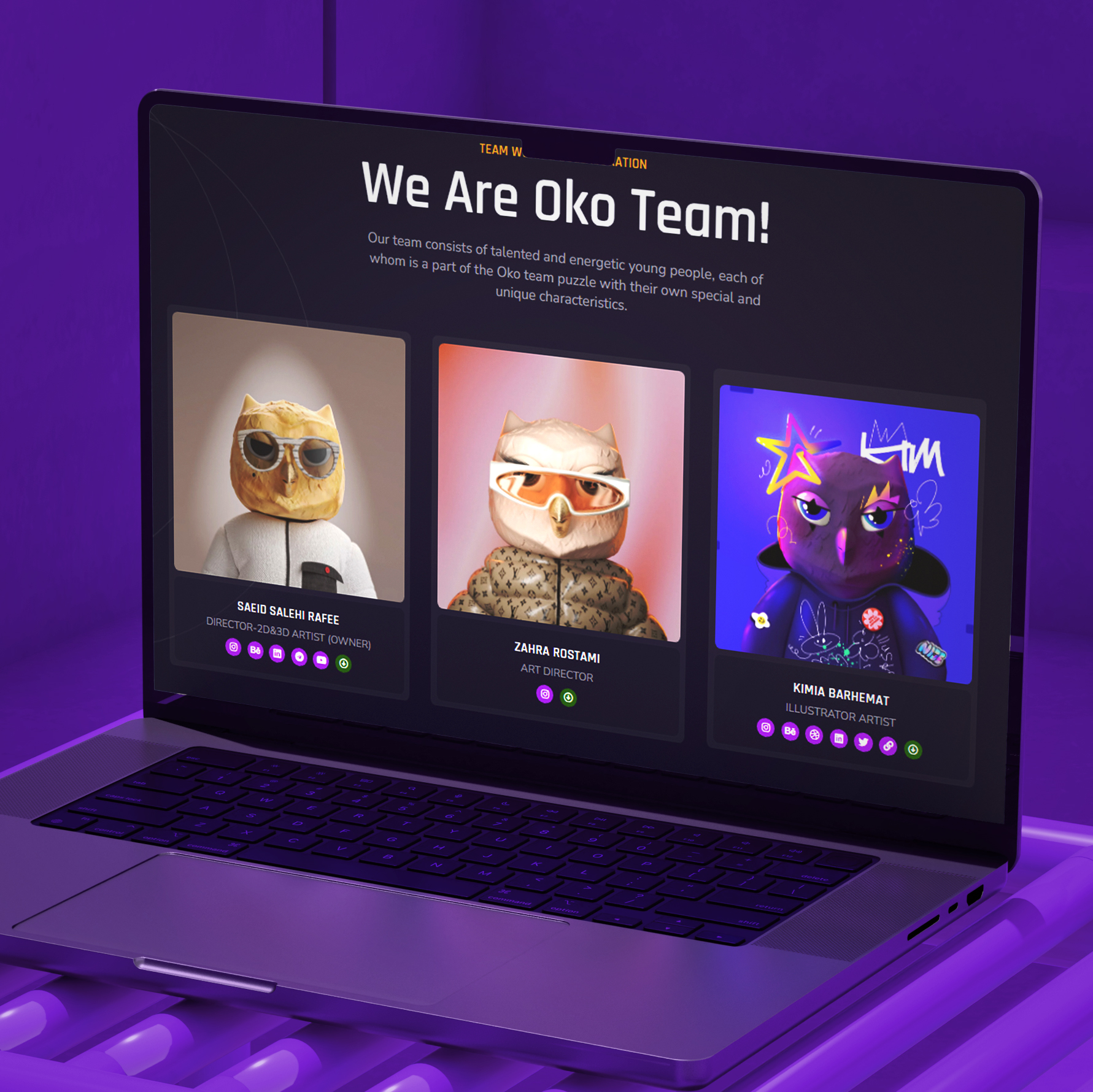
- Custom Mascot Design
Creative Approach & Design Language
Logo Design
Mascot Design
Website Design & Development
The website with a fully responsive layout optimized for all screen sizes. Our goal was to make the site not just visually aligned with OKO’s brand, but also technically sharp and easy to navigate. Key features include:
- Clear visual hierarchy with bold sectioning
- Responsive transitions and subtle microinteractions
- Seamless portfolio integration
- Technical SEO foundation and performance optimization
Throughout, we emphasized community, quality, and credibility — themes that appear across copy, layout, and motion.
Visual Identity
The visual system was designed to be bold, clean, and modular, capable of adapting across different mediums without losing coherence. A key part of our strategy was to ensure the new identity would feel natural and consistent alongside OKO’s own 3D and 2D creative outputs — maintaining harmony across internal and external brand materials.
- Typography: We selected Rajdhani as the main typeface — a sleek, futuristic, and readable font that balances technical precision with strong visual presence.
- Color Palette: The color direction was chosen to reflect both clarity and strength — blending clean whites and light neutrals with deep grays and electric blue accents. These tones reflect the agency’s digital edge while preserving a confident minimalism.
- Pattern & Application: Identity elements were modular, supporting layout systems that could be adapted to motion graphics, print, and digital assets.
Outcome
The final result is a sophisticated, future-forward identity that resonates with OKO Team’s strategic and artistic ethos. With a clean digital presence and a flexible brand system, OKO is now equipped to scale its reputation — communicating confidence, clarity, and creativity through every visual touchpoint.