Oak & Arc
Oak & Arc, a well-established company specializing in landscaping and plant retail, recognized for its commitment to quality and sustainable green solutions.
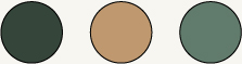
Color Pallete
Typeface

Project Overview
Oak & Arc approached with a vision to redefine its brand presence in the landscaping and plant retail sector. The objective was to create a cohesive visual identity that not only captured the essence of nature but also reflected the company’s dedication to quality and sustainable design.
Project Scope
- Logo Design
- Complete Visual Identity System
- Printables & Packaging Design
- Website Design
Natural Identity & Visual Language
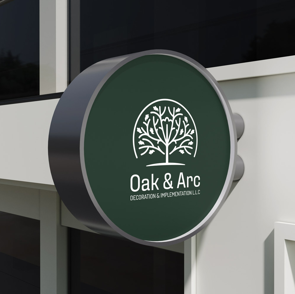
The visual identity for Oak & Arc was inspired by the elegance and resilience of oak trees. The logo design combined elements of an oak leaf and a stylized oak tree, symbolizing strength, growth, and nature’s harmony. The chosen color palette of green and gold represented lush landscapes and premium quality, while white space was intentionally integrated into the design to reflect Oak & Arc’s minimalist approach to space and design.
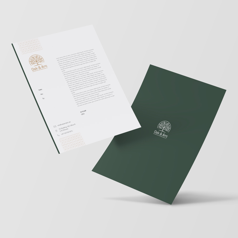
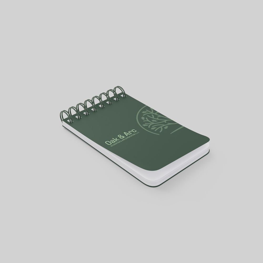
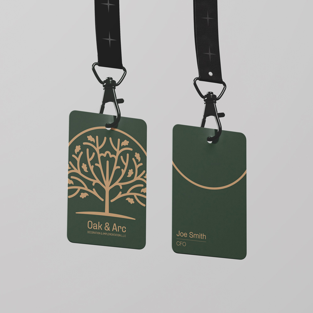
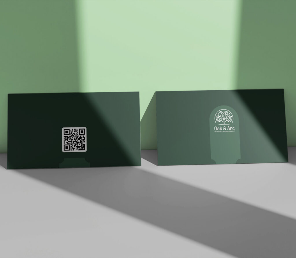
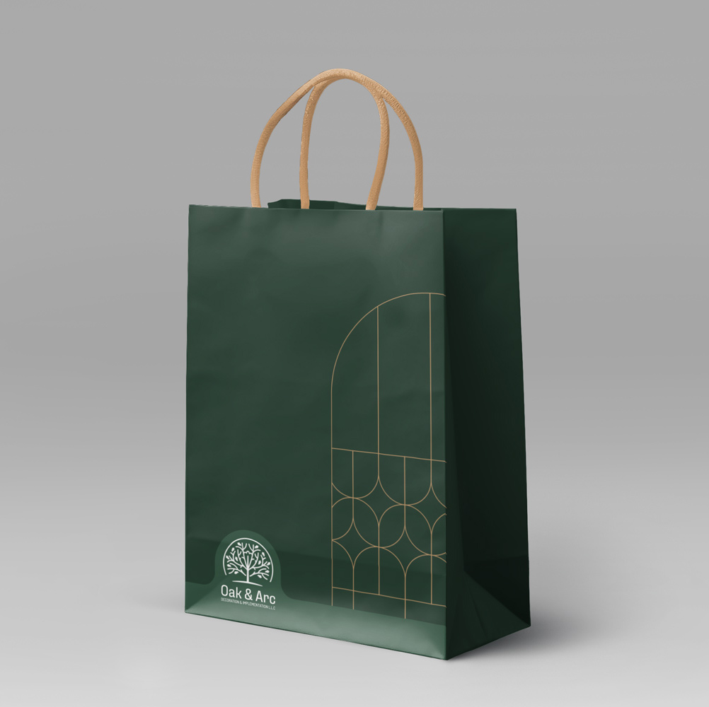
Packaging & Printables: Sustainable & Elegant
Packaging and printables were designed with eco-friendly materials, keeping Oak & Arc’s commitment to sustainability at the forefront. Patterns inspired by natural elements like leaves and plant silhouettes were used across various print materials, enhancing brand consistency and visual appeal.
Website Design & Development
A modern, UI-driven website was designed for Oak & Arc, with an emphasis on clean lines and expansive white space to reflect the brand’s philosophy. Best UX practices were implemented to ensure seamless navigation, offering users a curated experience as they explore Oak & Arc’s landscaping services and plant offerings. The design maintained strong visual coherence with the brand’s identity, reinforcing its presence in the digital landscape.
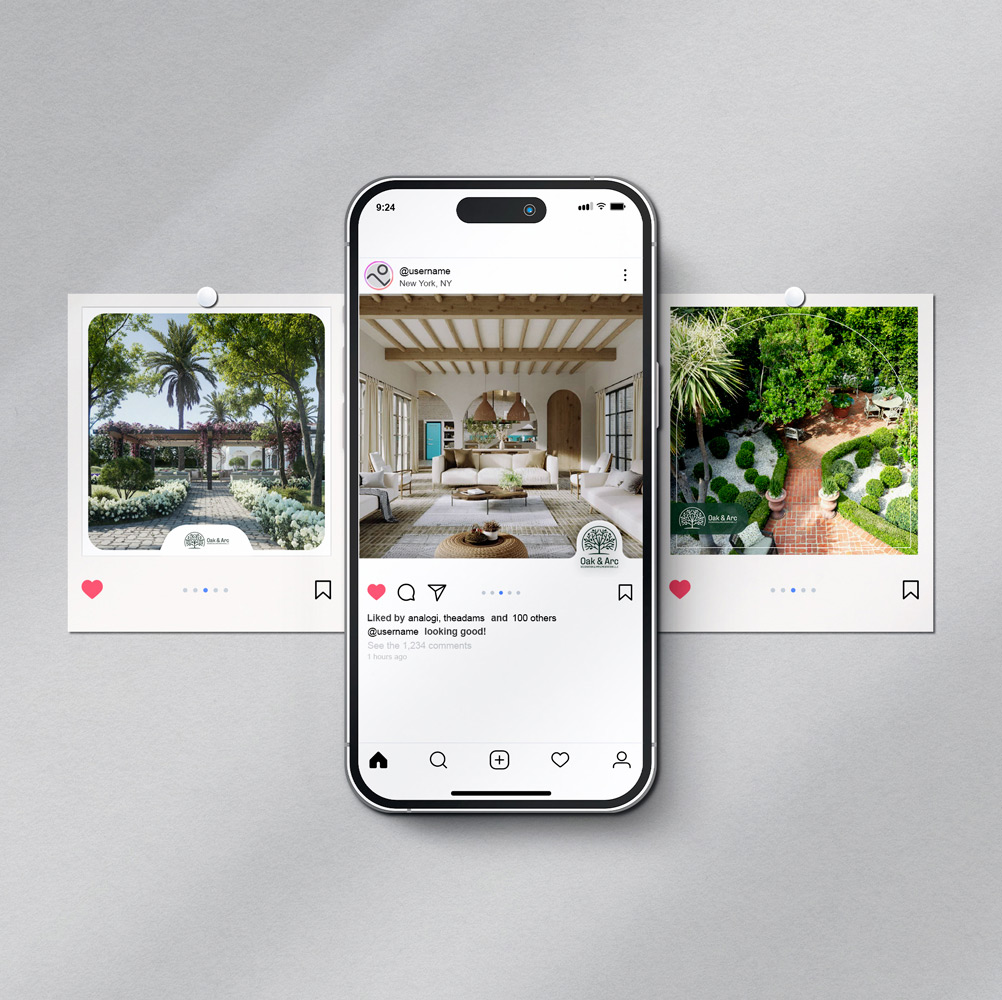
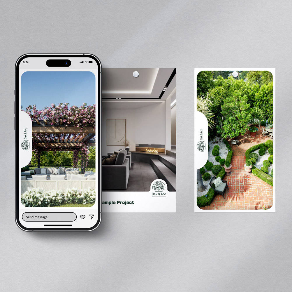
Social Media Design
Instagram templates for posts and stories were created based on Oak & Arc’s visual identity. These templates ensured consistency and brand recognition across social platforms while enhancing user engagement. Designed with the same natural patterns, elegant typography, and color palette, the social media content upheld the brand’s aesthetic and messaging in every interaction.
Outcome
The final result is a sophisticated, future-forward identity that resonates with OKO Team’s strategic and artistic ethos. With a clean digital presence and a flexible brand system, OKO is now equipped to scale its reputation — communicating confidence, clarity, and creativity through every visual touchpoint.