Kanza
Kanza, a distinguished name in luxury furniture, known for its exquisite craftsmanship and sophisticated designs that embody elegance and modernity.
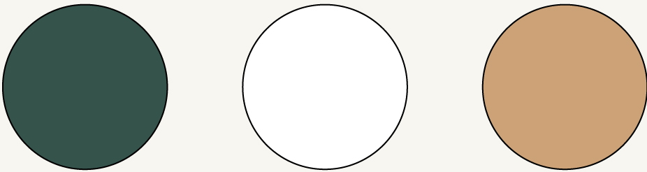
Color Pallete
Typeface

Project Overview
Kanza approached with the objective of developing a visual identity that encapsulates its reputation for luxury and craftsmanship. As a leader in the high-end furniture market, Kanza sought a brand image that not only reflects its premium product line but also resonates with modern design sensibilities.
Project Scope
- Logo Design
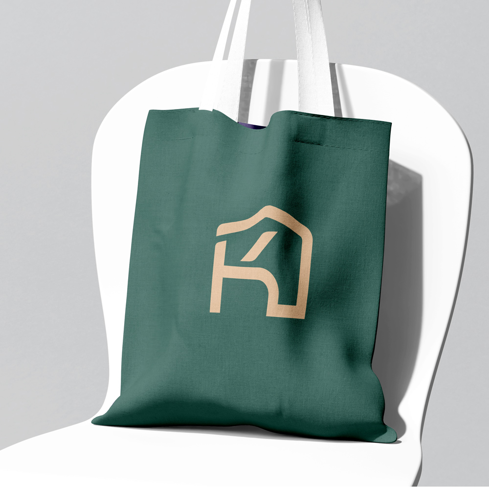
- Complete Visual Identity System
- Printables & Packaging Design
- Signage and Label Design
Elegant Identity & Visual Language
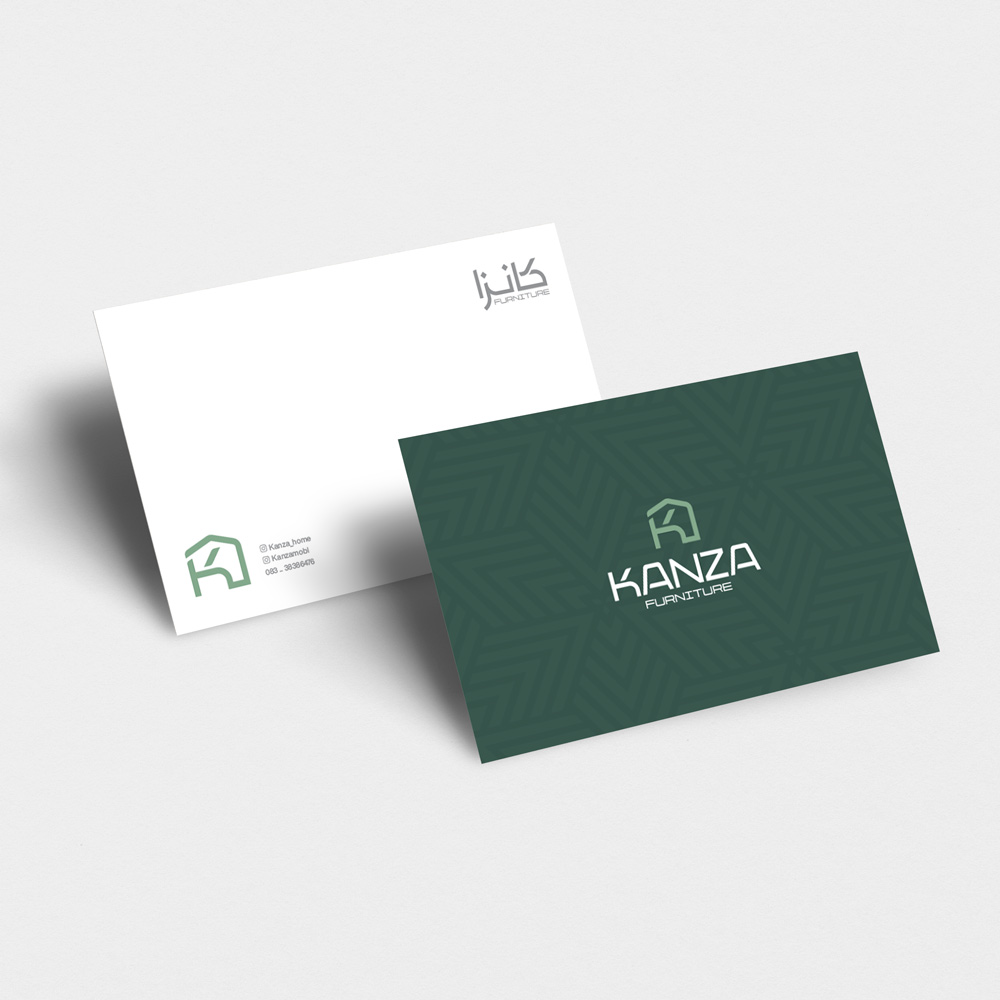
The logo for Kanza was crafted to represent both sophistication and industry relevance. Designed around the letter ‘K,’ the logo subtly integrates the shapes of a chair and a house—symbols of comfort and space. This visual metaphor perfectly captures the essence of Kanza’s business: luxurious living through beautifully designed furniture.
The visual identity is built upon a color palette of dark green and gold, carefully chosen to convey opulence and timelessness. The deep green symbolizes growth and stability, while the gold accents reflect luxury and high value. The typography was selected to balance modern aesthetics with classic elegance, reinforcing the brand’s prestigious image.
Luxurious Patterns & Brand Elements
To extend the visual language, a series of elegant patterns were designed, inspired by contemporary interior motifs and fine detailing found in luxury furniture. These elements were incorporated into print materials and digital assets, maintaining brand consistency across all mediums.
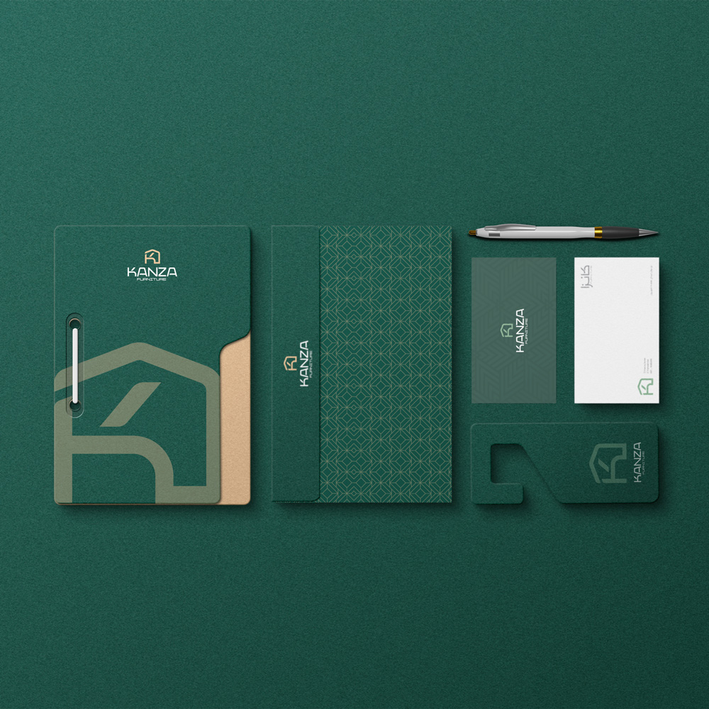
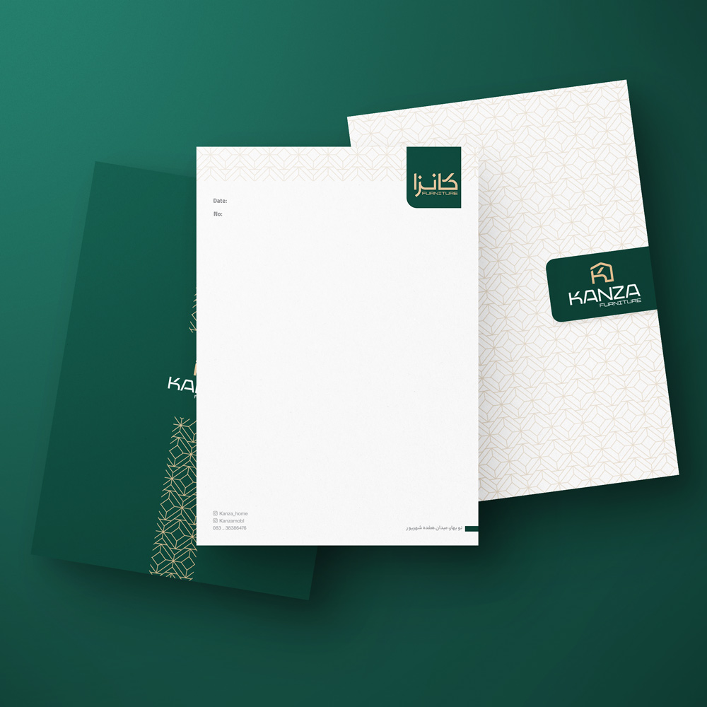
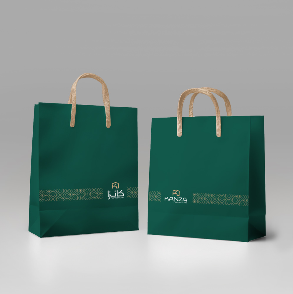
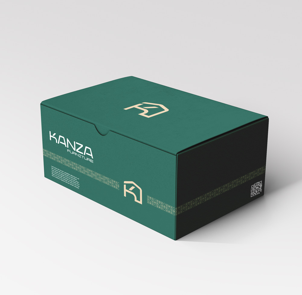
Premium Packaging & Printables
Kanza’s packaging and printables were designed with meticulous attention to detail, mirroring the brand’s commitment to luxury. The dark green and gold color scheme, along with refined patterns, were used to elevate unboxing experiences and add a touch of exclusivity to every interaction. Signage and labels were also crafted to blend seamlessly with interior design aesthetics, reinforcing brand presence in both showrooms and retail spaces.
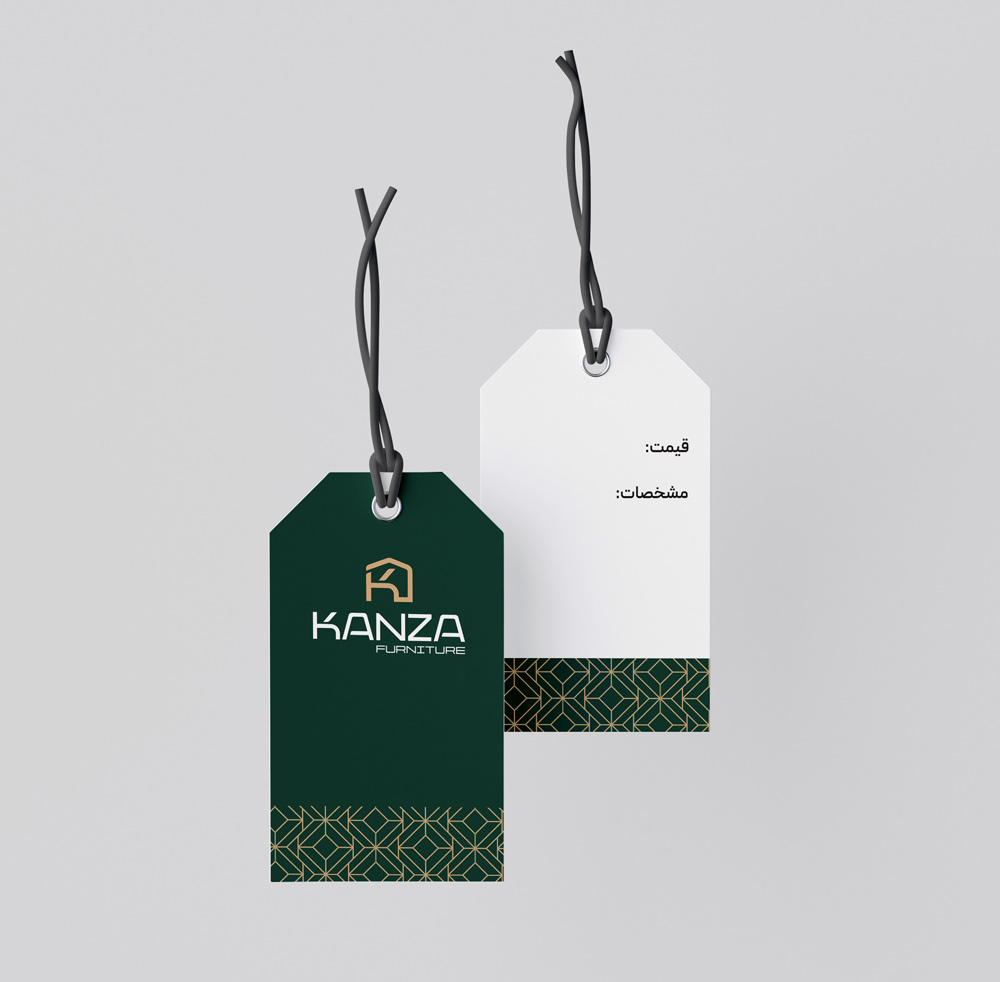
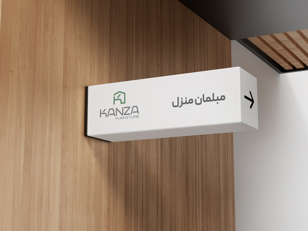
Signage & Label Design
The design of signage and labels for Kanza was approached with the same attention to luxury and detail. Gold-accented finishes and minimalist layouts ensured that every label and sign not only communicated clearly but also enhanced the visual appeal of Kanza’s showroom environments.
Outcome
Kanza now presents itself as a benchmark of luxury and modern elegance in the furniture market. Through a cohesive visual identity and premium packaging solutions, the brand experience reflects its dedication to quality and design excellence, solidifying its position as a leader in luxury furniture.