Amin Café
Amin Café, a cozy neighborhood spot known for its high-quality coffee and inviting atmosphere, attracting young locals for their daily gatherings and coffee rituals.
Color Pallete

Typeface

Project Overview
Amin Café approached with a clear vision: to create a brand identity that is both simple and modern, mirroring the quality of its coffee and the warmth of its community space. The objective was to design a visual experience that would resonate with its youthful patrons while maintaining an air of elegance and clarity.
Project Scope
- Logo Design
- Complete Visual Identity System
- Printables & Packaging Design
- Café Menu Design
Creative Approach & Design Language
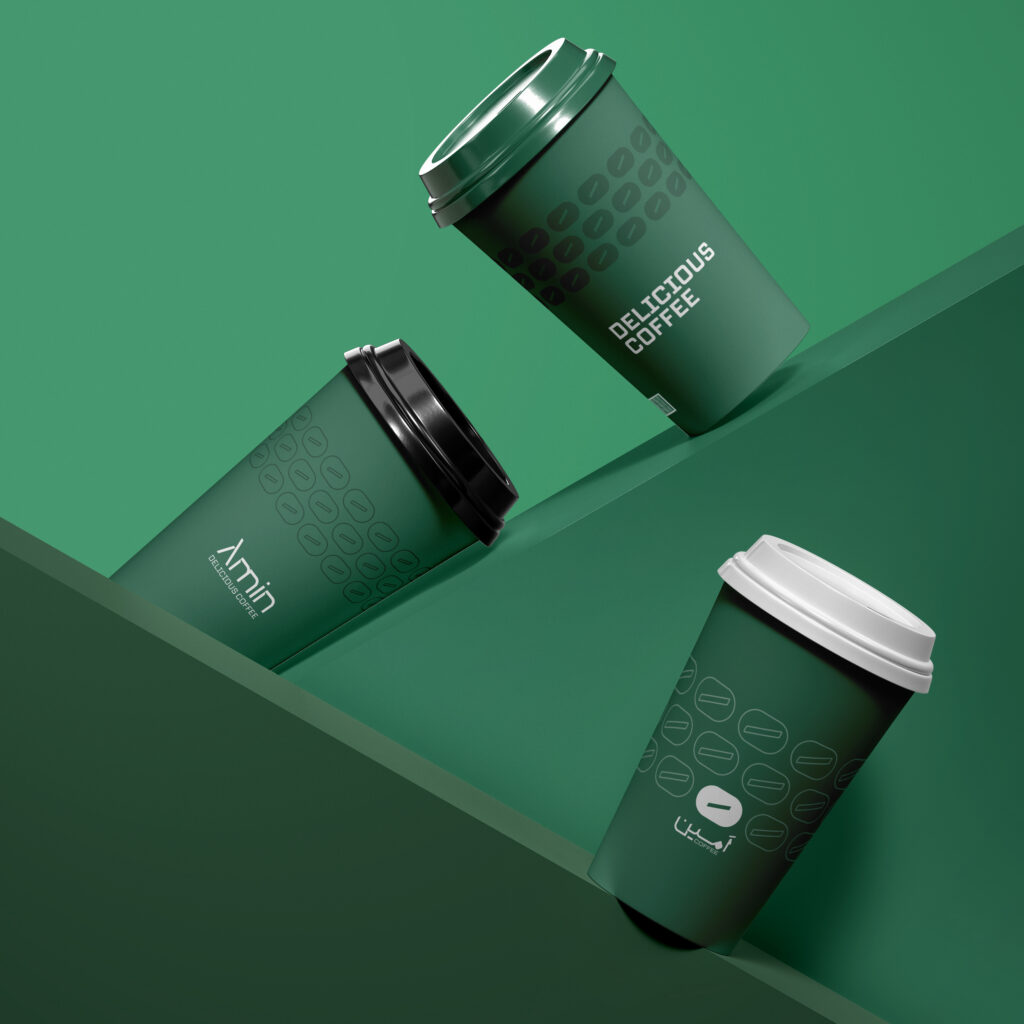
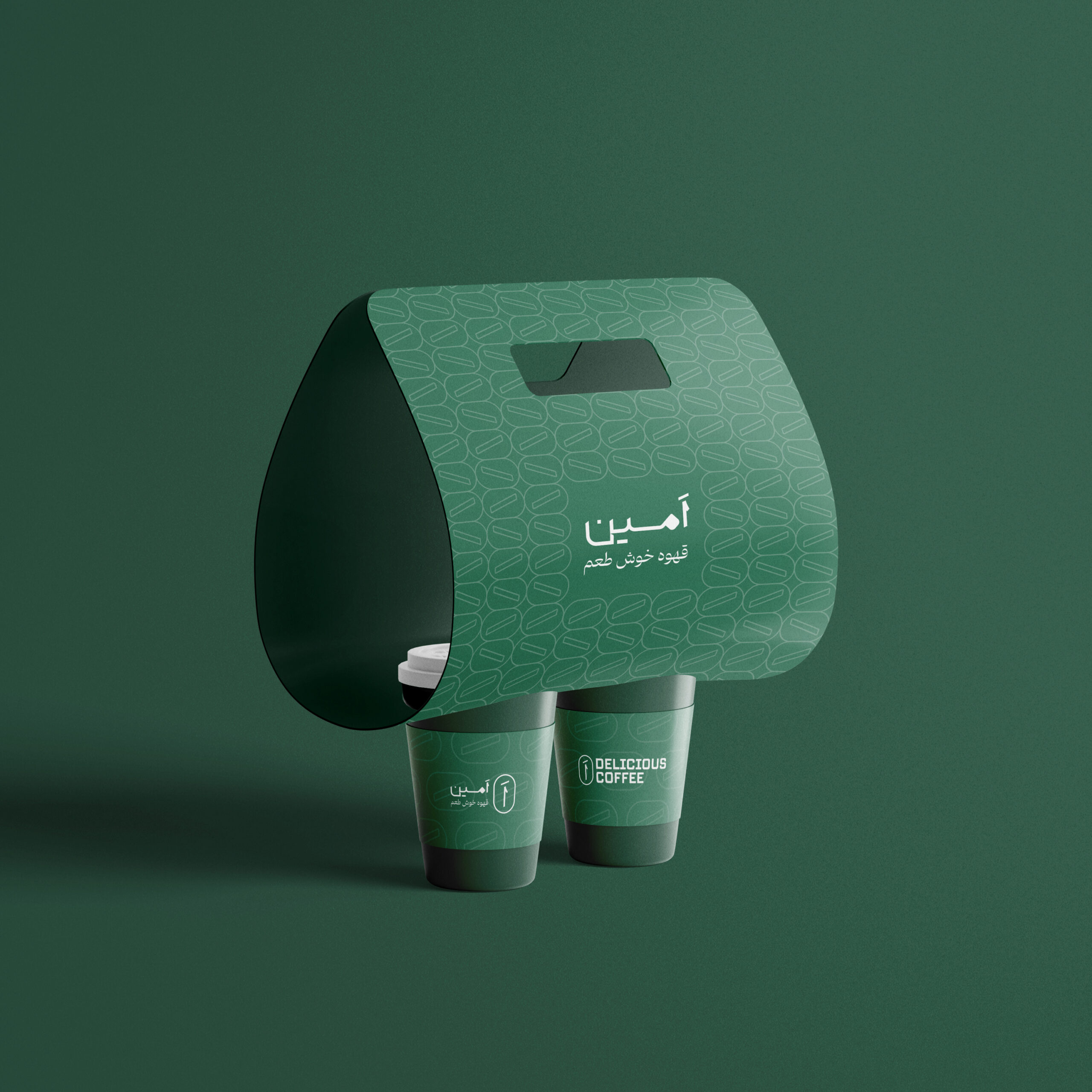
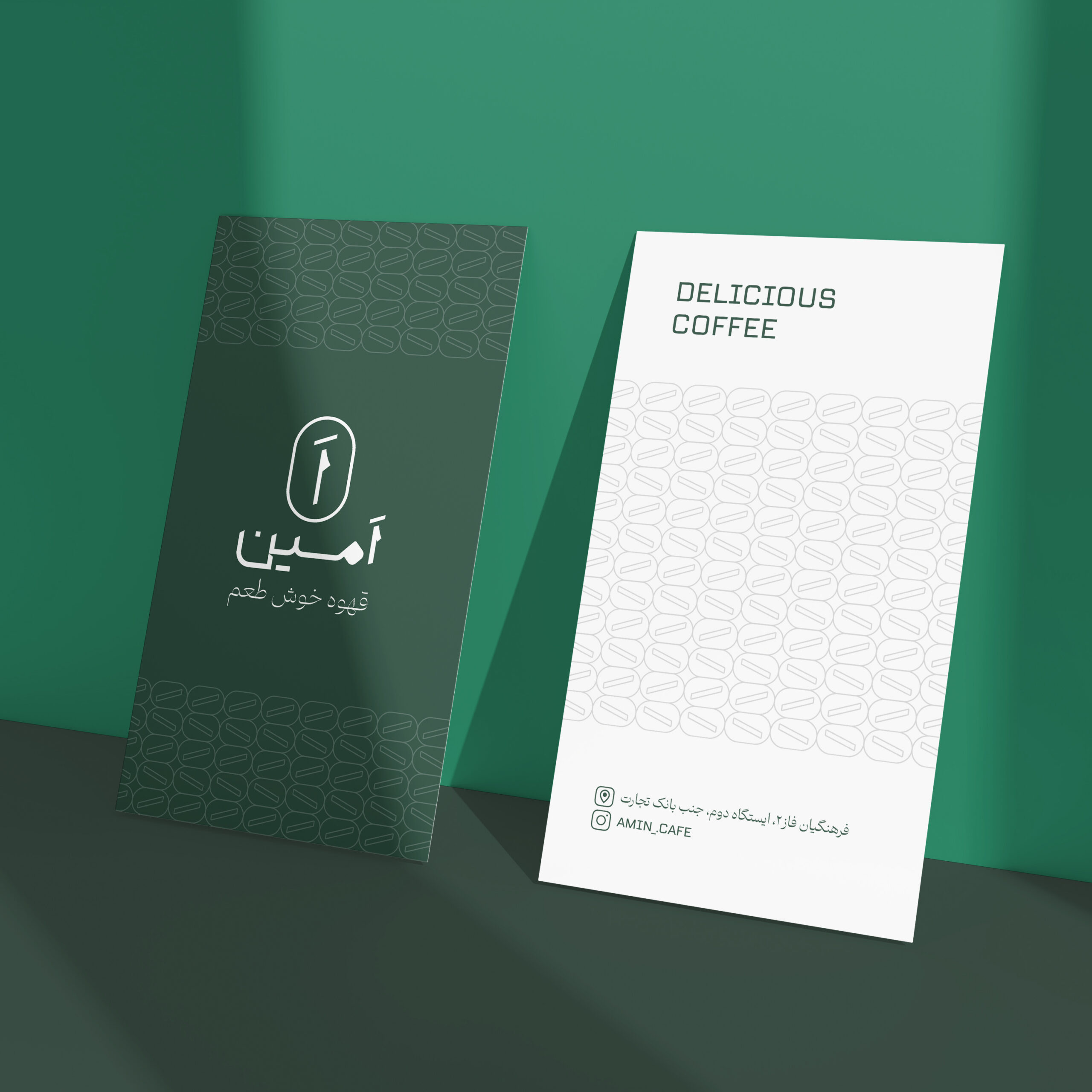
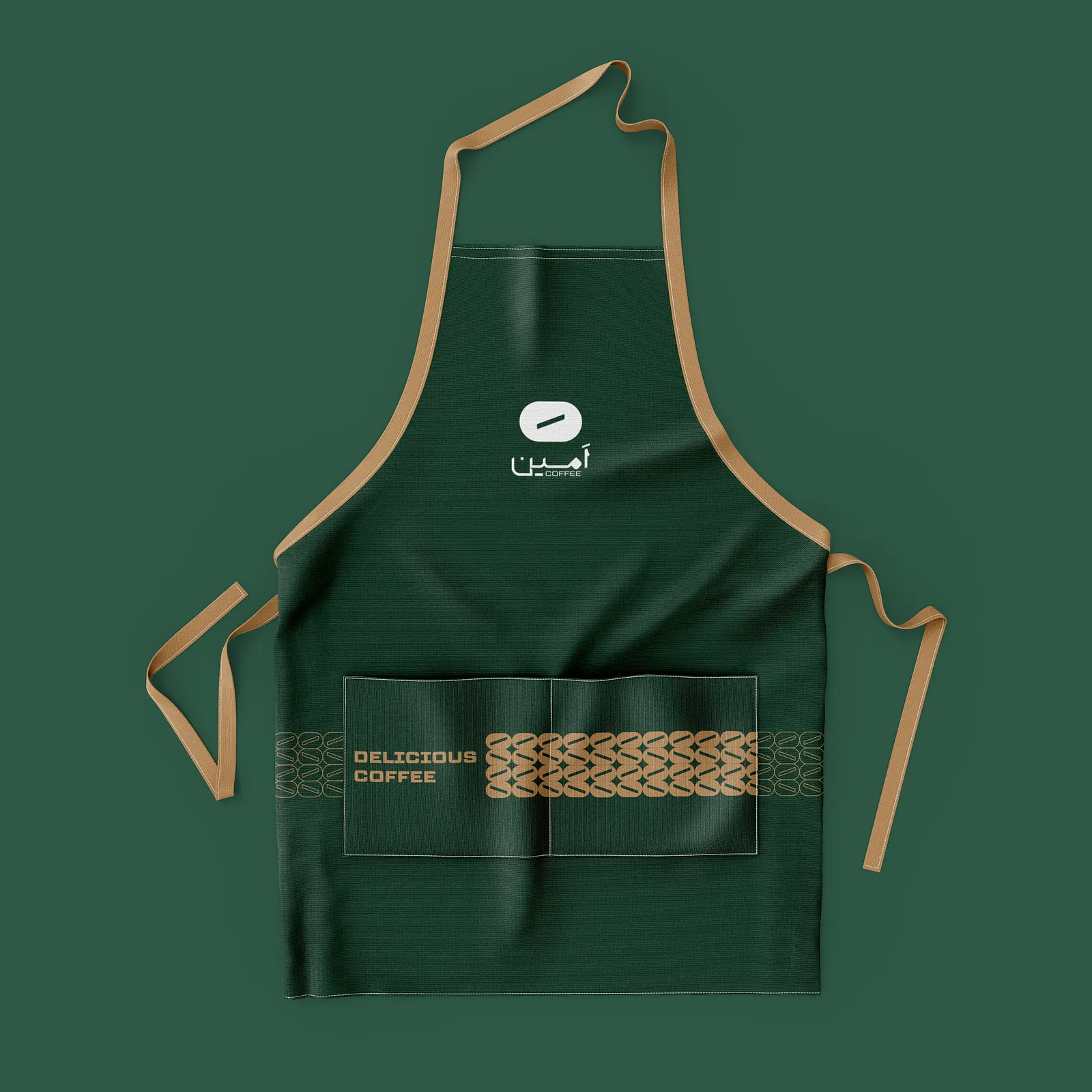
The logo design for Amin Café centers around its name “Amin,” combined with a symbolic coffee bean crack that subtly hints at its specialty. Two distinct typefaces were employed — TT Lake for its clean, modern structure and Dowran for a touch of sophistication — perfectly balancing simplicity with character.The color palette features a harmonious blend of green, black, and white, reflecting both freshness and timelessness. These colors were consistently applied across all brand elements, maintaining visual clarity and elegance.

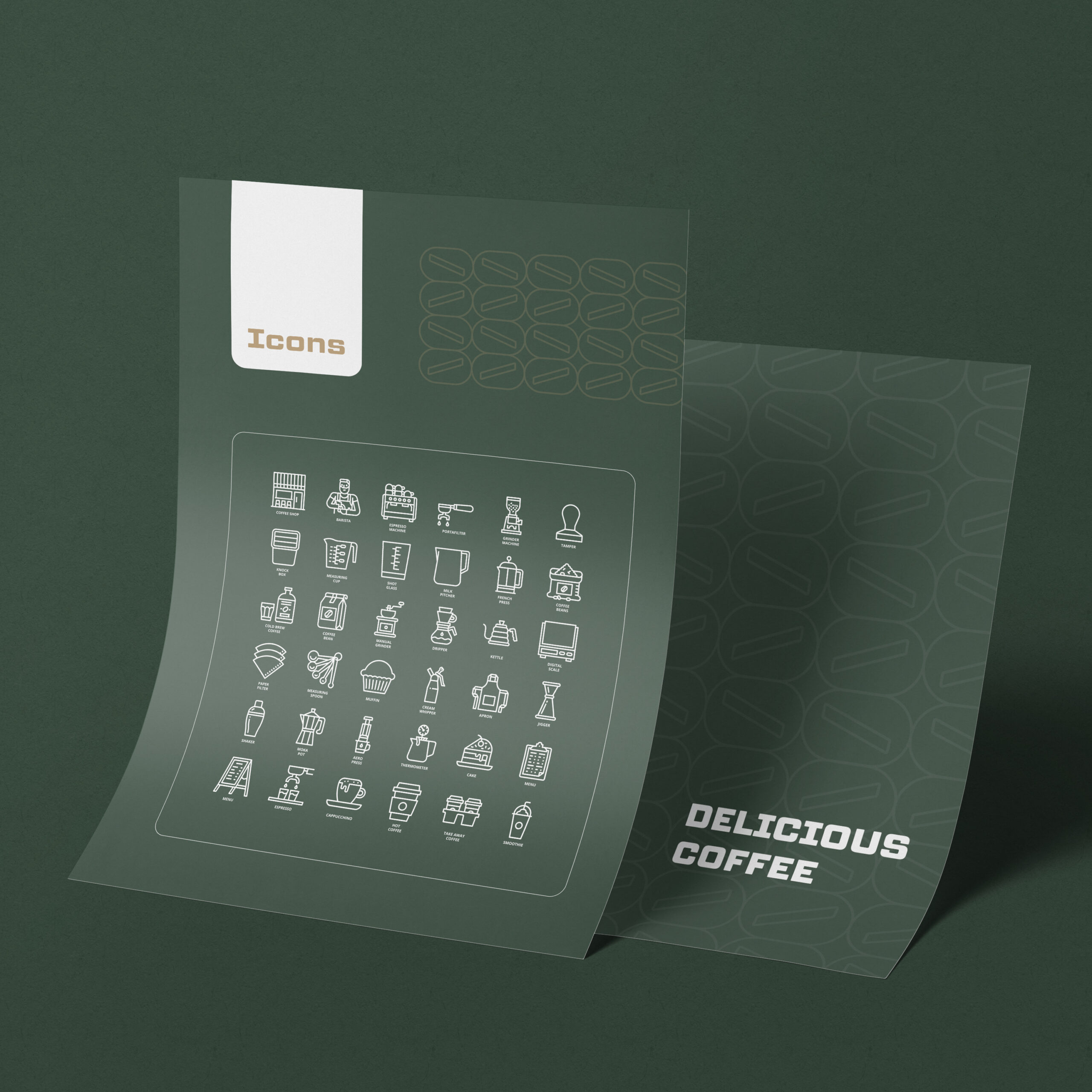
Patterns Inspired by Coffee Culture
To enrich the visual identity, minimalist patterns inspired by the shape of coffee beans were designed. These motifs are subtly integrated into packaging designs and printed materials, giving a nod to the café’s essence without overwhelming its clean aesthetic.
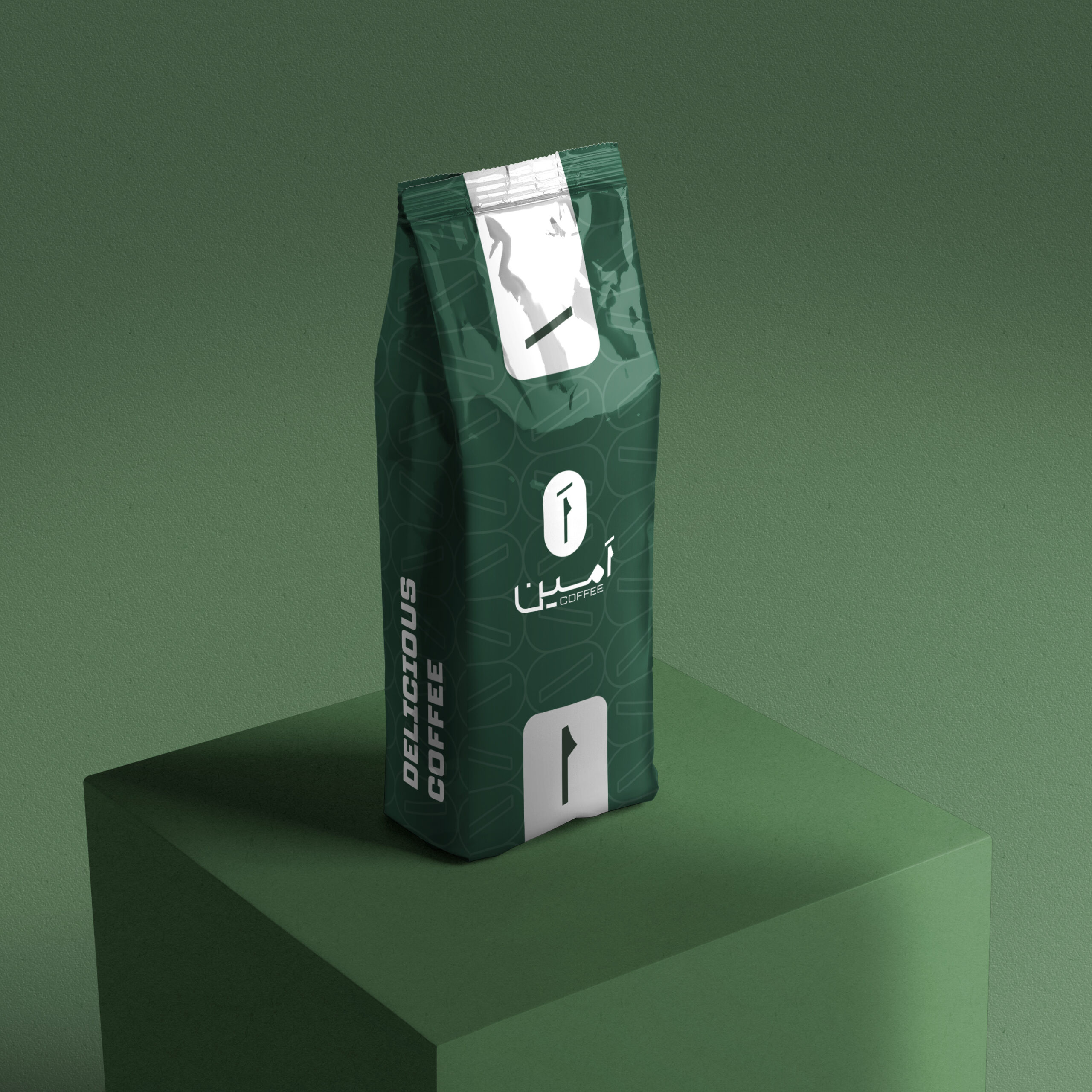
Thoughtful Packaging Design
Packaging for Amin Café was designed with practicality and brand storytelling in mind. From paper cups and bottles to cookie packaging and various types of bags, each item was meticulously designed to reflect the brand’s modern simplicity. The consistent use of the green, black, and white color scheme, along with coffee bean-inspired patterns, ensured that the visual identity remained cohesive across all touchpoints.
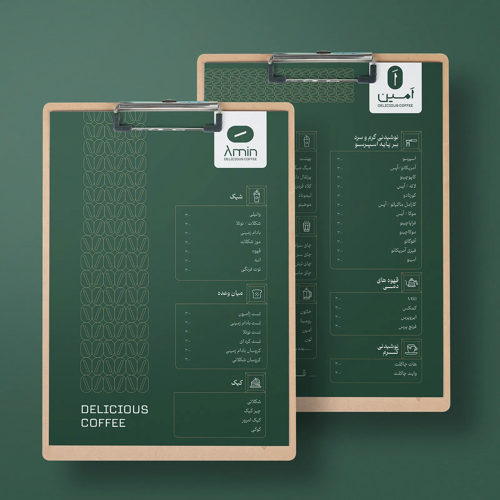
Minimalist Menu Design
The brand’s visual clarity was extended to its menu design. Clean typography and spacious layouts were used, offering a seamless browsing experience and making it easy for customers to explore their coffee and snack options without visual clutter.
Outcome
Amin Café now stands as a neighborhood icon for quality coffee, distinguished by its simple yet modern branding. The cohesive visual identity, from its logo to its packaging, successfully captures the café’s welcoming vibe and commitment to quality. The community’s response has been overwhelmingly positive, solidifying Amin Café as a go-to spot for local gatherings and coffee moments.